5 Day Design Sprint
A five day intensive design exercise to quickly test product hypotheses, through research, ideation, rapid prototyping and user testing.
Roles & Responsibilities
• Research • UI Design
• UX Design • User Testing

The Problem
Parents want to spend more time reading to
their children, less time searching for stories.
Users
Parents and care givers who read to their children.
Scope & Constraints
• 5 day GV style design sprint
• Concept project
• Tablet based application
• Solo Design Project
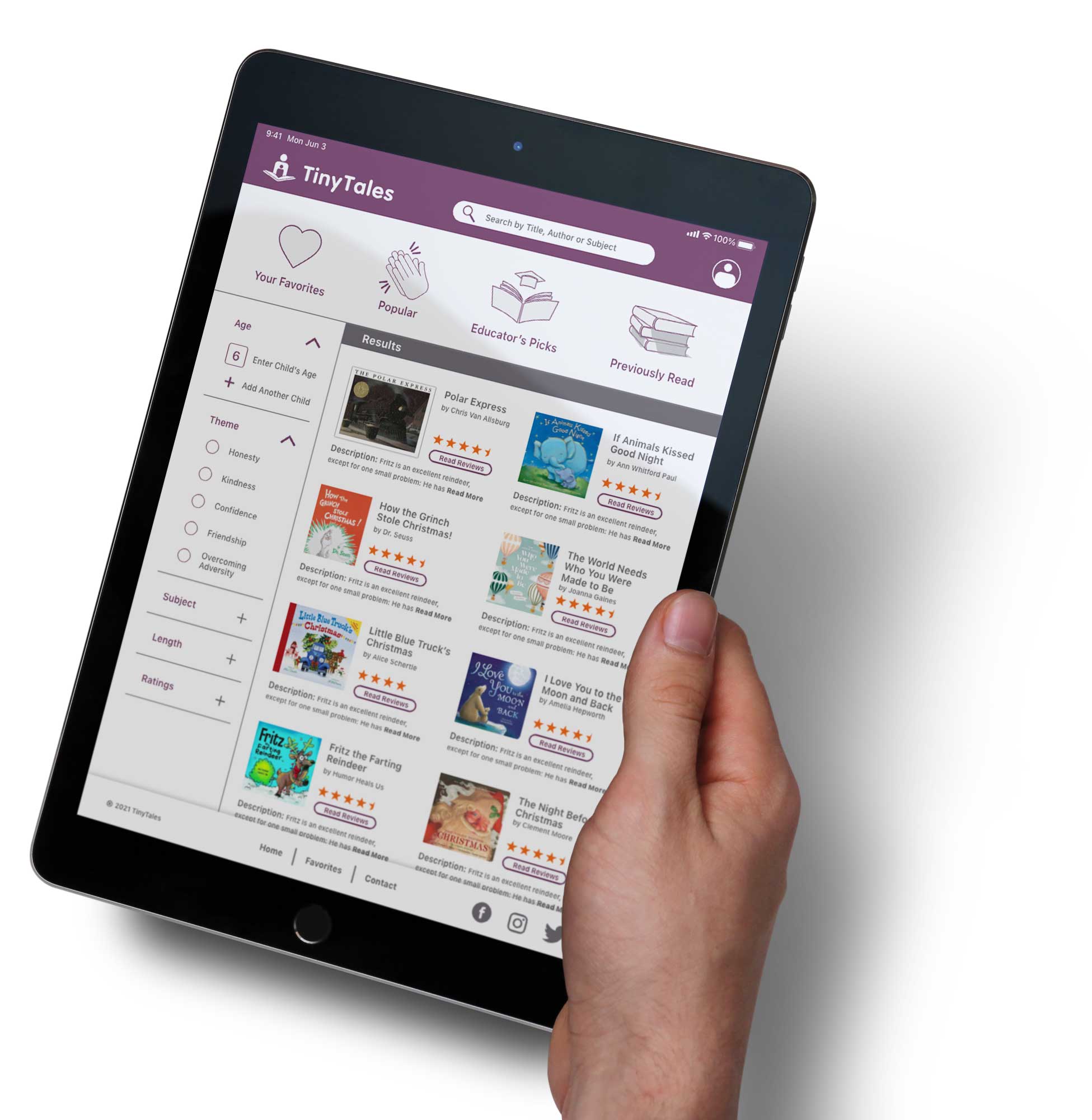
The Solution
An easy and quick resource allowing users to quickly find stories that fit they and their children’s tastes.
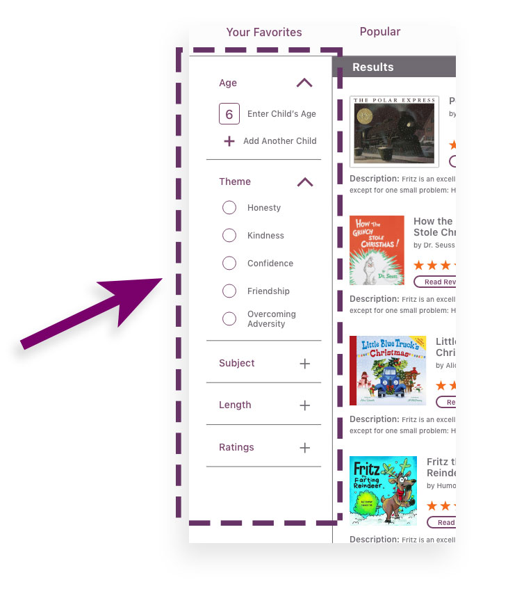
Filters
Narrow searches using multiple criteria.
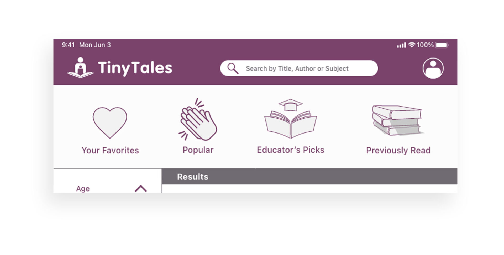
Quick Links
• Find by name, author & subject
• Access personal lists
• View suggested lists
Context
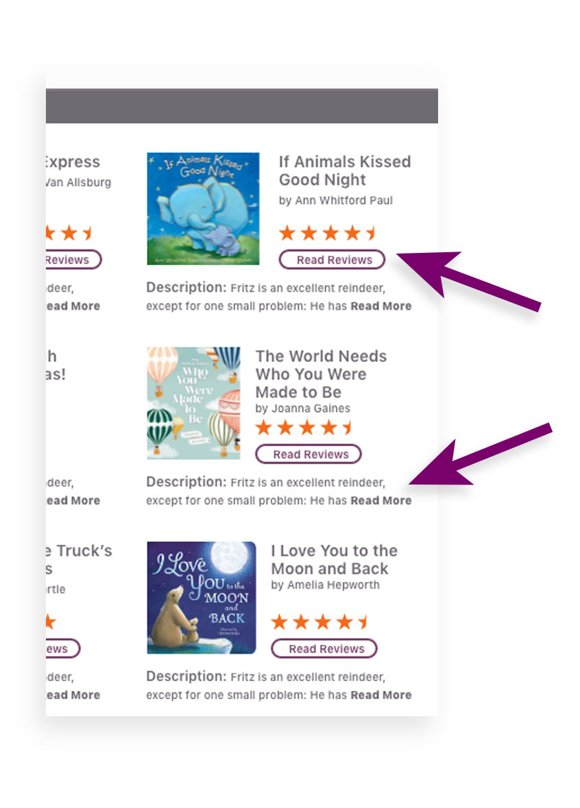
• Easy to find reviews
• Story synopsis
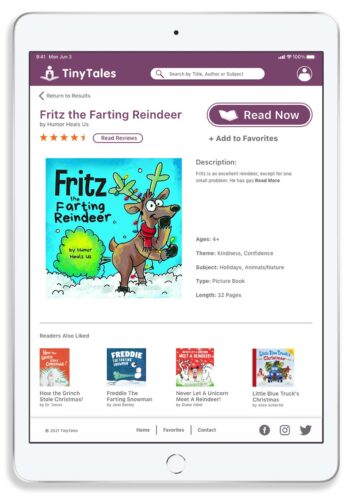
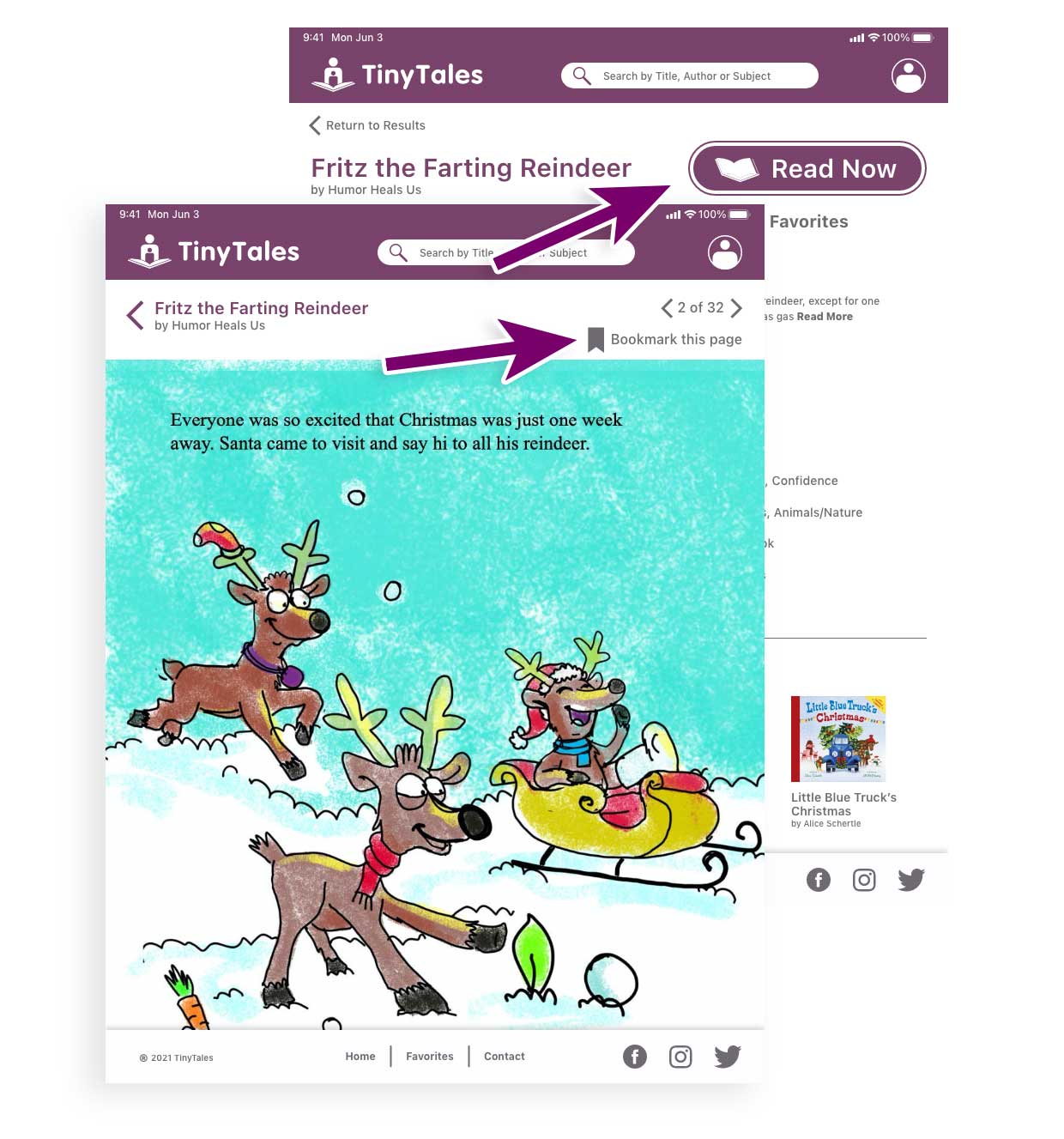
Easy Access
• Simply start reading
•> Find where you left off
The Process
A five-day intensive user experience design exercise for answering critical product and business questions through design, prototyping, and testing ideas with customers.
Continue reading for a step-by-step tour of the project.
Day 1
Understand the Problem
• Listened to interviews with reading parents.
• Read notes from interviews & surveys with reading parents.
Set goals
• Long Term: A simple interface for choosing an appropriate story for specific children (age, subject, etc.)
• Doubts & Questions: What are the most important criteria for parents? How do I provide options while maintaining a simple quick interface?
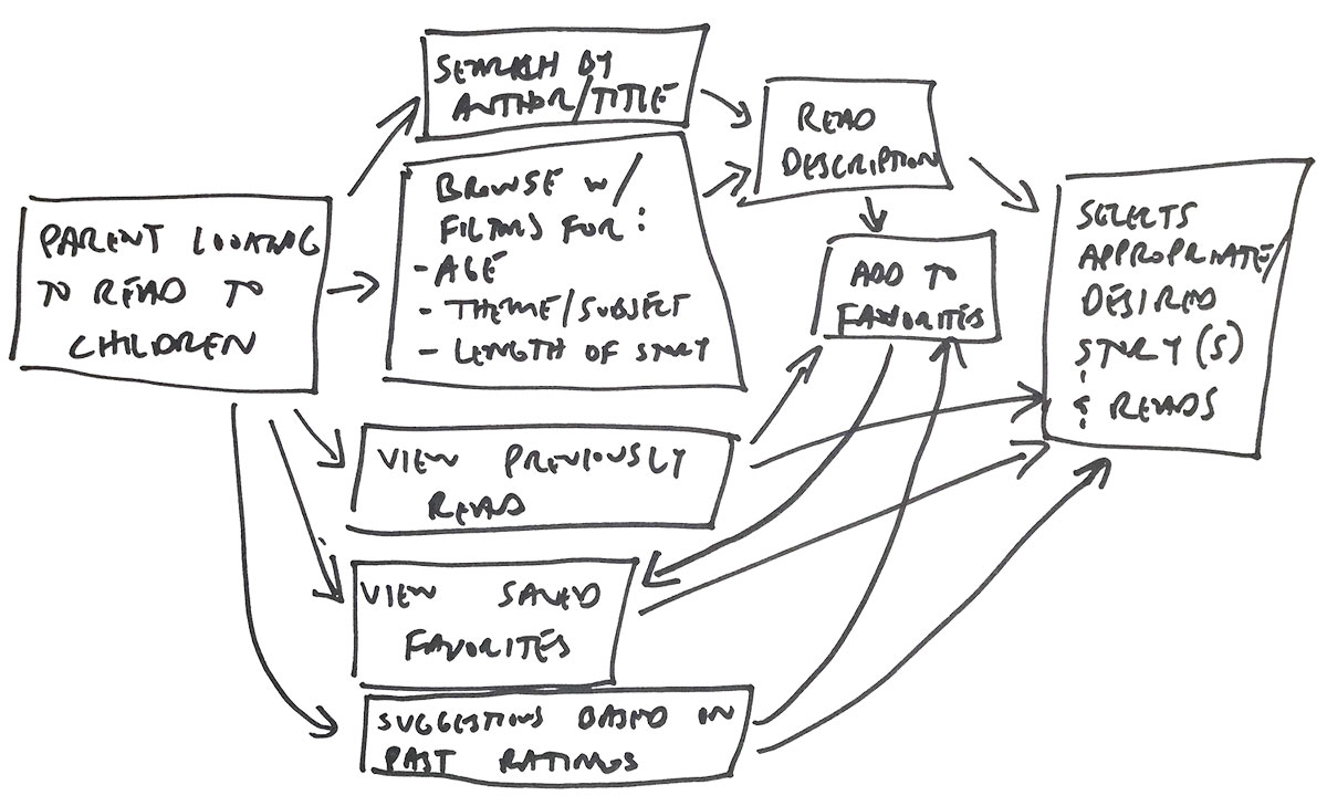
Map
(Desired User experience)
Target:
• Our persona, Claire, is 34-years-old and has two children, Kayla (4) & James (6).
• Focus is on the moment Claire is trying to find a story at bedtime. The children may be tired and impatient, story must be enjoyable and carry a lesson.
Day 2
Lightning Demos
(Review solutions from other companies, industries, or old internal ideas.)
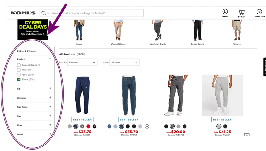
Kohls.com
• Multiple filters narrow a search as criteria is entered while remaining on the same screen.
• This approach could be used for selecting age, theme, story length, etc.
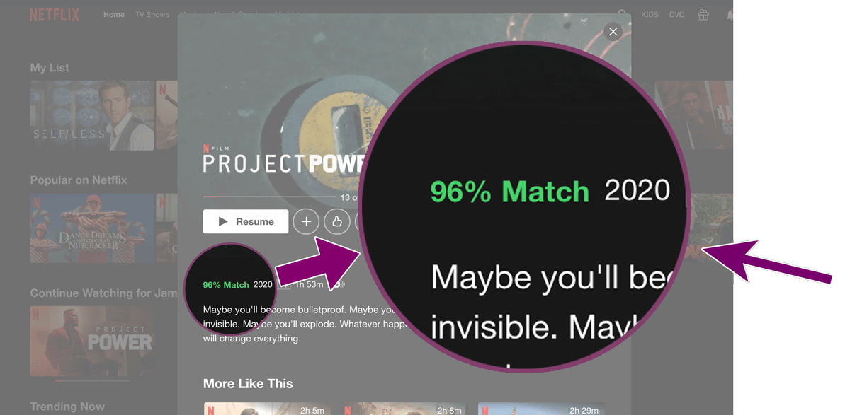
Netflix.com
• Suggestions made based upon previously entered user ratings.
• Books can be suggested based upon ‘liking’ or highly rating previously read books/stories.

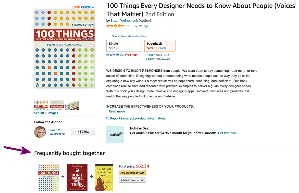
Amazon.com
• Individual listings can provide additional suggestions, of similar (or ‘readers also liked’).
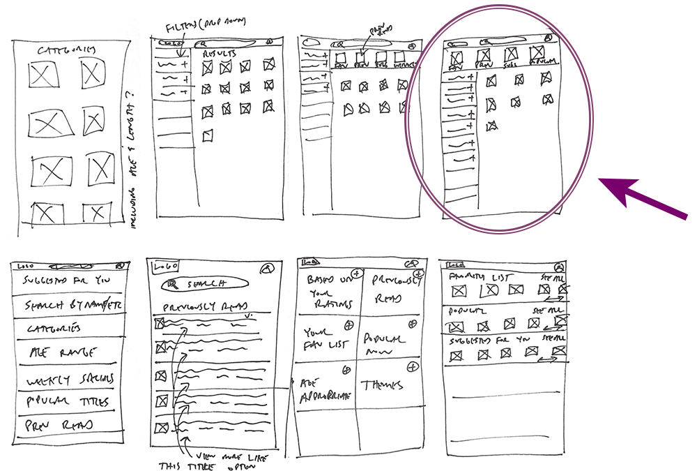
Crazy 8’s
(Sketch 8 solutions in 8 minutes. Select one, or a combine qualities of a couple, towards your “Solution Sketch”)
Critical screen was selected due to:
• Top banner with site/logo, search and profile
• Secondary banner provides quick links to useful options
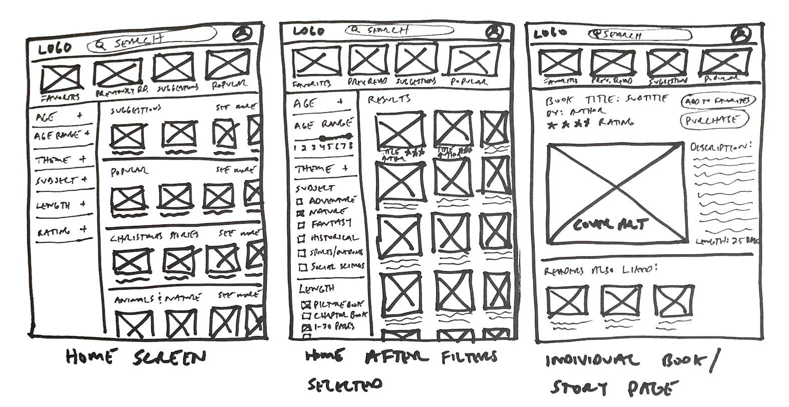
• Layout below, separated into filters (left ⅓) and results (right 2/3), allowing search results to update without leaving the page.
Solution Sketch
(Detail the critical screen and previous and next screens)
• Filter results by age, theme, subject matter, length and user ratings.
• Filters expand and contract, for visual clarity or detail, when needed.
• Individual story page, with ratings, description, save for later, etc.
Day 3
Storyboard
(A step-by-step plan that will guide the prototype)
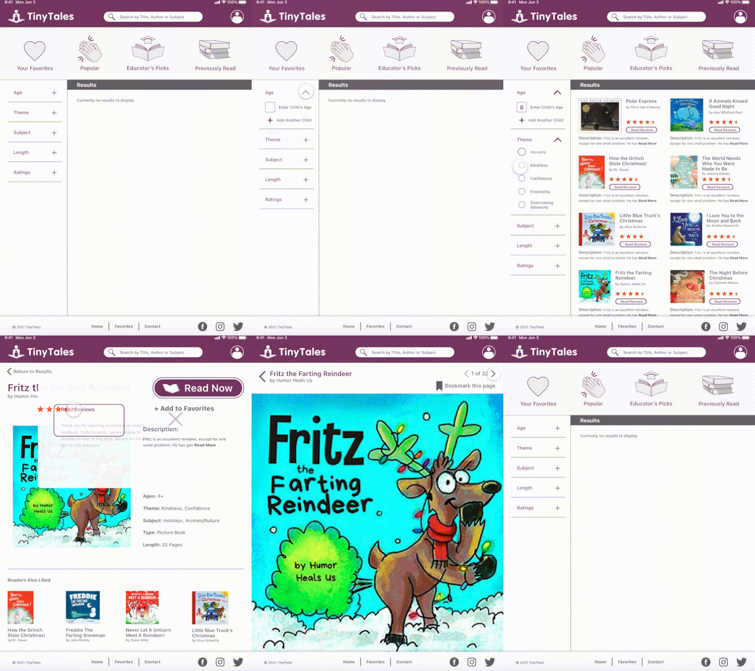
What happens from the moment the adult decides to read to the child(ren), to when they start reading? Below you see the target journey.

Day 4
Prototype
(Create a facade, with little functionality, to test hypotheses about solution ideas)
By building a refined looking prototype, with just enough usable choices to complete a simple search, I was able to assess the value of resources and how well users’ can distinguish their purpose.

Original Logo

New Logo
Branding
While the primary color was provided a few of the elements I considered were:
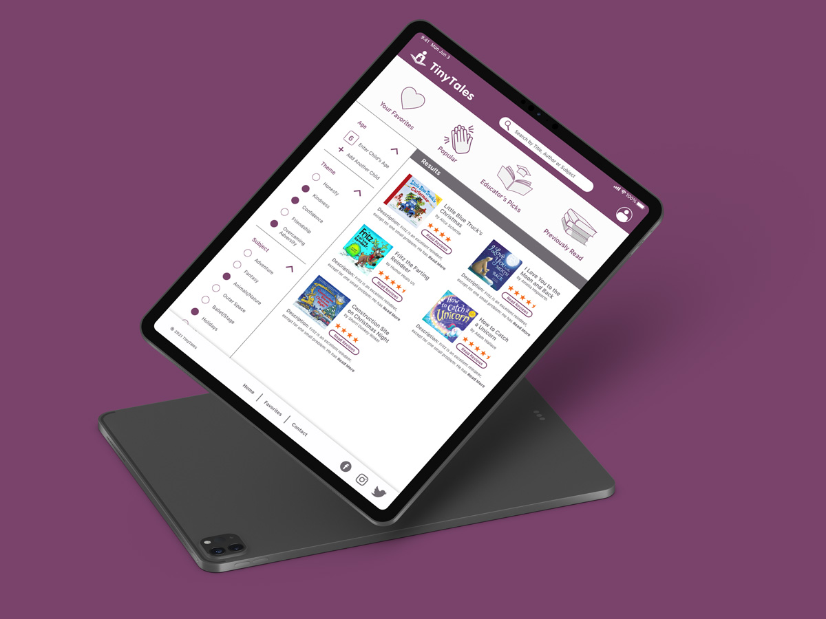
• Recreating the logo, speaking more to the experience of reading to a child.
• Providing simple menu choices with accompanying icons, so the site was easy to both navigate and view.

Day 5
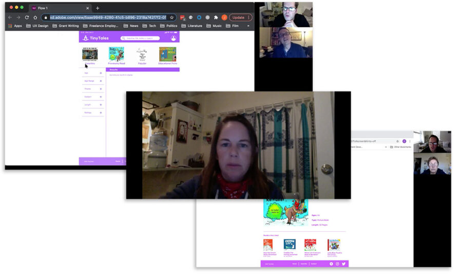
User Testing & Interviews
(collect data from actual users. How are solutions received?)
Users interviewed:
• Carol P., grandmother of six children, 5, 9, 12, 19 & 21 year olds.
• Jason C., in a relationship, partner has two small nieces 1 & 3.
• Jenny P., married with two children, 12 & 21.
• Sarah F., married with two children, 5 & 9.
• Cara P., married with three children, 6, 9 & 13.
Interview & Testing Results:
• Great insights were gleaned from users’ sharing specific experiences. The stress and anxiety many shared echoed early research, informing many of the navigation and layout decisions noted above.
Conclusion
At the culmination of this 5 day project, the prototype is still mainly a design facade, however many of the potential tools/resources have been sufficiently evaluated.
If I were to move forward, I feel there is enough here to begin development of the product.
Play with the prototype here.
Lessons Learned
Overall
• The simple layout was appreciated so users easily identified their options.
• The original color was too bright and off-putting. Implementing a more muted tone, still supported a clear visual hierarchy, while being easy to look at.
• Displaying fewer options, with obvious call to actions is essential for what might be a stressful experience.
Filters
• Structuring filters in a familiar form made their use immediately recognizable.
• Multiple filters proved useful for narrowing searches.
• Users saw no need for an “age range” filter (eliminated after testing), preferring to simply enter their child (or children’s) age.
• Filter controls were initially too large and felt cramped (adjusted after testing).
• One user was confused about the difference between “Themes” versus “Subject”.
• A user suggested adding socially relevant topics to subjects such as “Diversity”, “Inspirational Figures”, etc.
• Formatting filters (themes & subject) similar to the public library’s online UI would reinforce the “Consistency & Standards” Heuristic.
Quick Links
• The original visual representation of the four by thumbnail images of book covers was bewildering to 80% (4 of 5) of users. This was resolved once icons replaced the thumbnails.
• There was some confusion if the “Favorites” and “Previously Read” quick links were redundant. I’d be interested to test return users, to see if the potential for creating a list ahead of time provided any value.
Search Results
• Providing immediate options for reviews and summaries in the search result cards facilitated quick decisions.
• “Read Now” is easy to find.
Individual Book Screens
• “Description” needed greater visual weight, as it was initially bold, but the same size as surrounding text.
• “Bookmark this page” was recognized by all subjects as a potentially being quite useful.


