
A mobile application to simplify the travel experience, allowing users to focus on their primary objective, rejuvenation.
Roles & Responsibilities
• Research • UI Design
• UX Design • User Testing

The Problem
The excitement and joy of travel can quickly transform into frustration and anxiety when facing unexpected circumstances.
Users
Travelers, from the meticulously planer
to the free spirits and all in between.
Scope & Constraints
• Develop this concept project into a usable high-resolution prototype.
• Time limitation 10 weeks.
• 1 round of interviews.
• 4 rounds of remote moderated user testing.
• 1 person UX/UI team.

The Solution
Help travelers quickly and easily get their trips back on
track when presented with unforeseen obstacles.

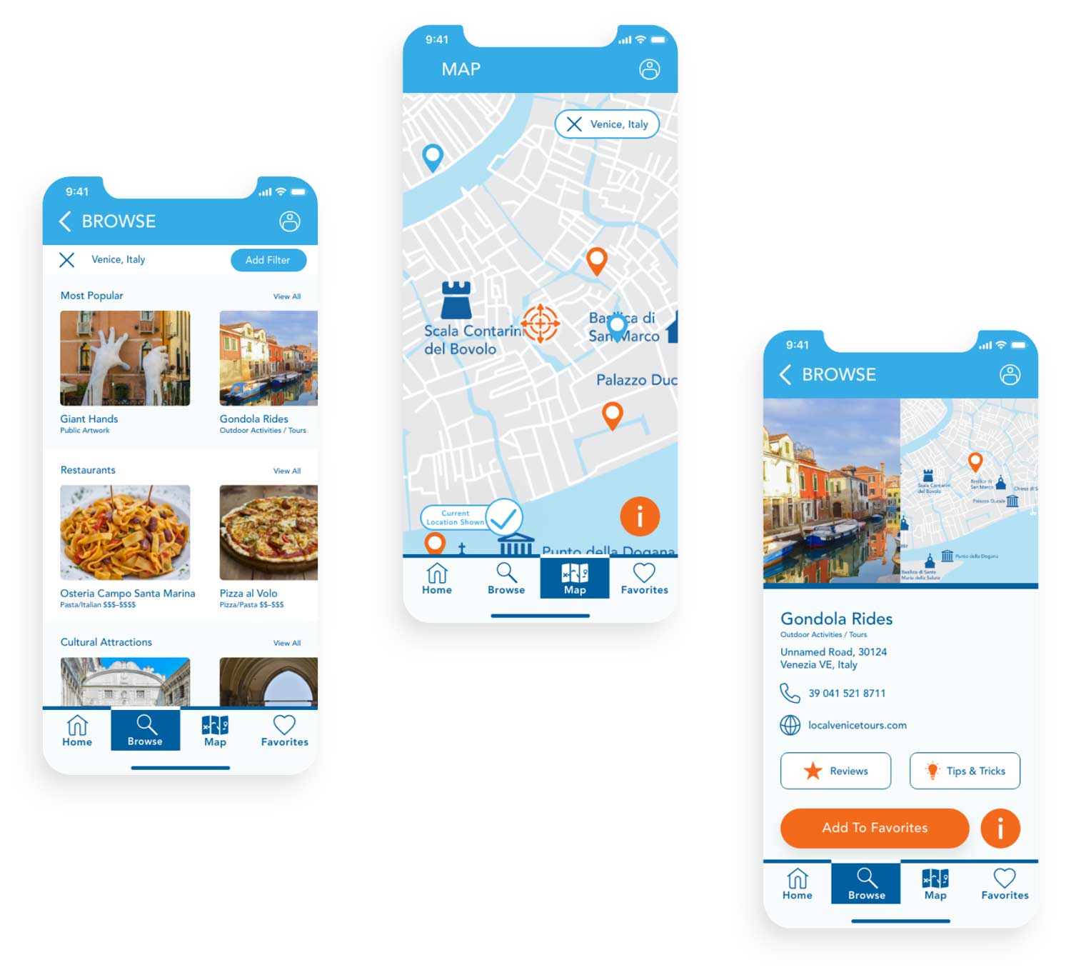
Search
• By Name
• By Location
• Using a Map
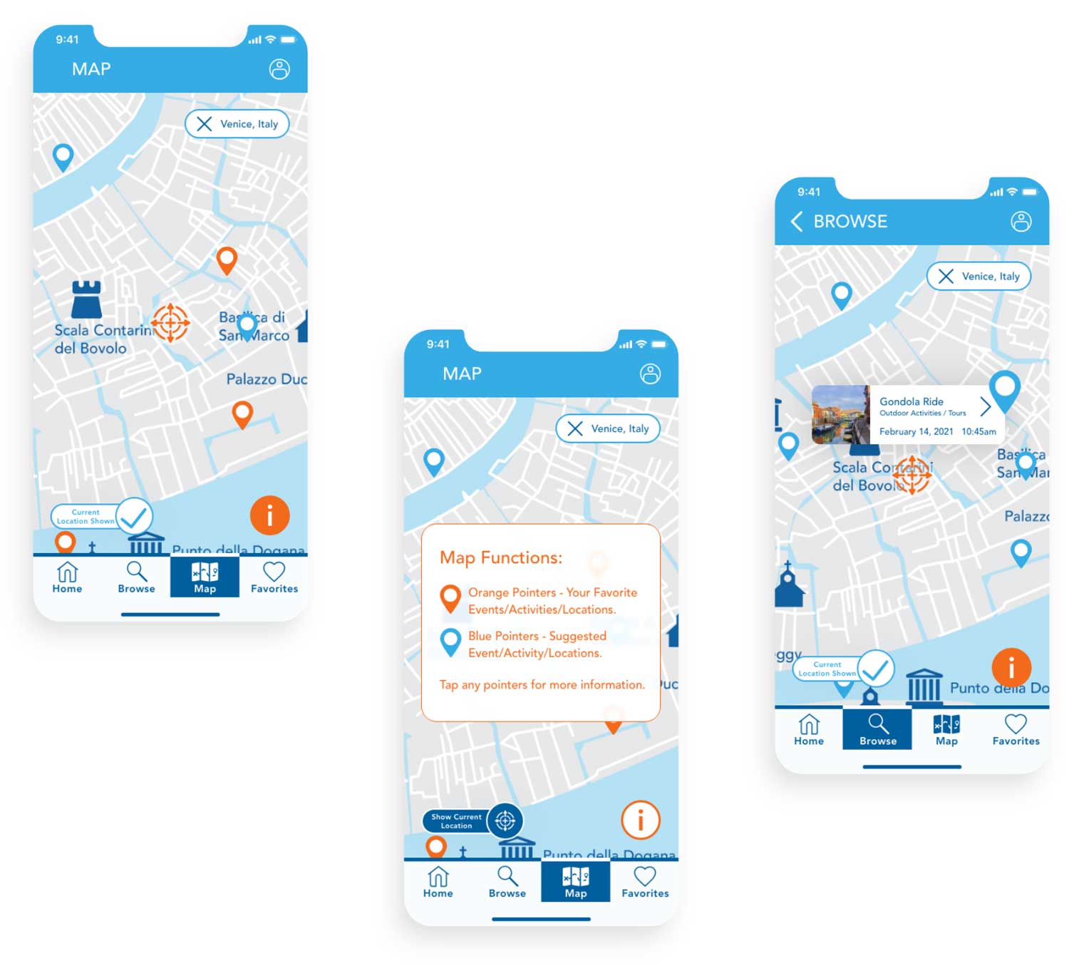
Adapt
See saved and alternate
points of interest nearby.
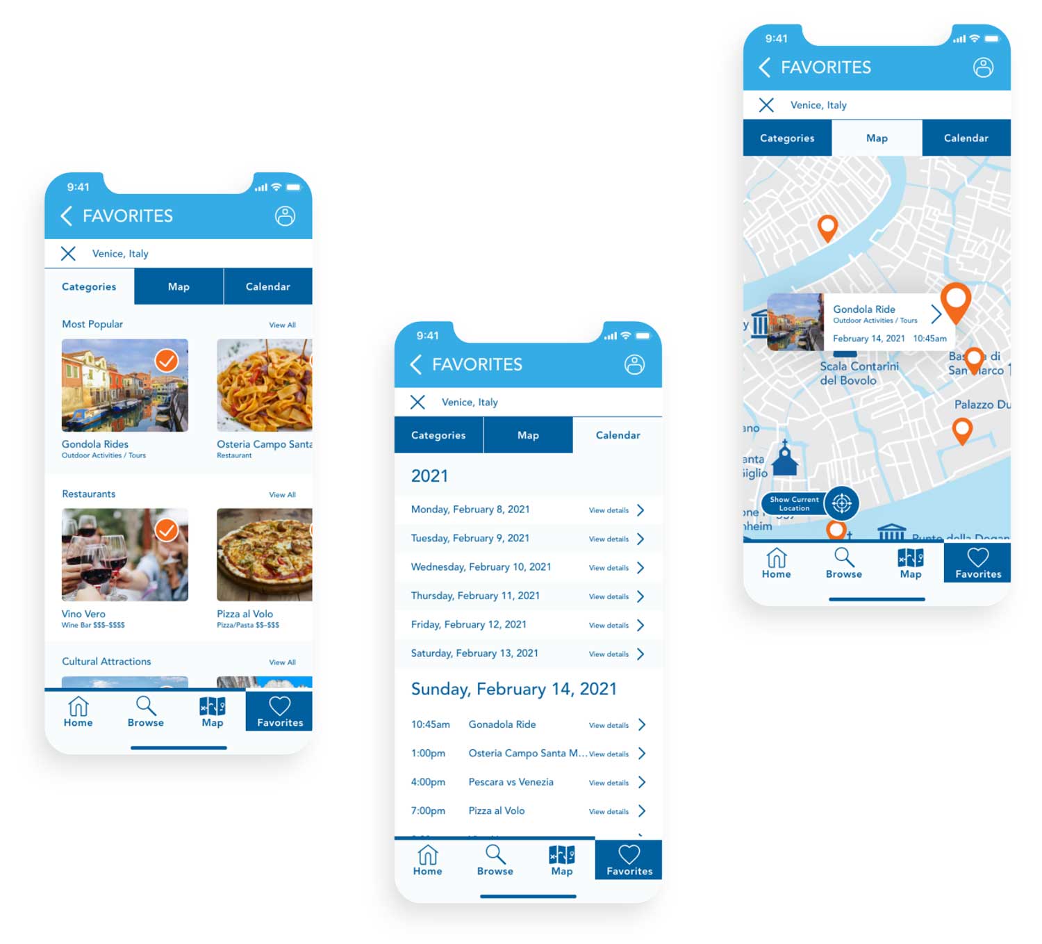
Organize Your Trip
• As a List
• A Customized calendar
• On a map
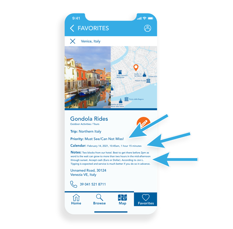
Convenient
Selected/saved items can be:
• Designated by priority.
• Assigned to a calendar, with duration
(if known, for easier scheduling).
• Given personalized notes.

The Process
Initial Research
• Secondary Research, gaining a better understanding of current competitors, potential user groups and their needs and expectations.
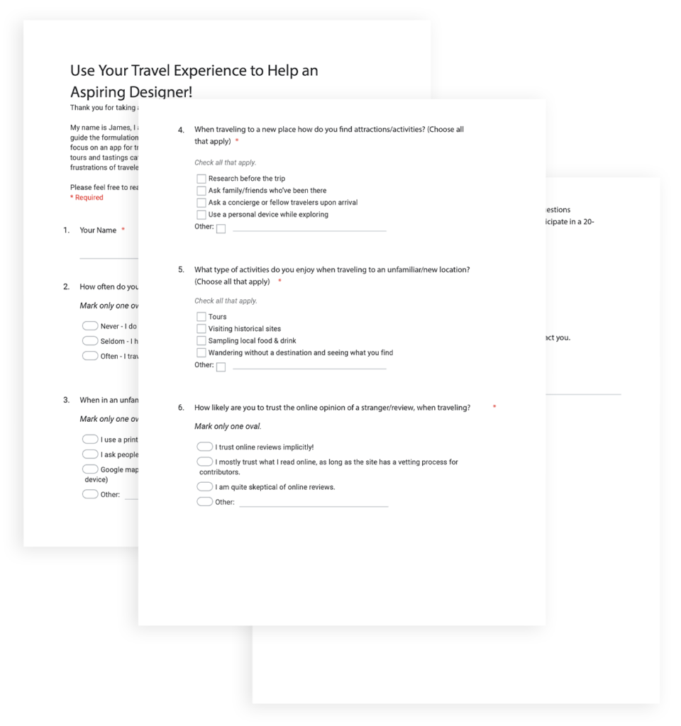
• A Survey to identify frequent travelers.
• Interviews with frequent travelers, gaining insights from their expanded experiences.
Research Synthesis
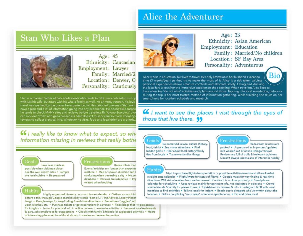
User Interview data, augmented through an Affinity Map, identified patterns revealing two main user archetypes (Personas):
• The careful planner.
• The carefree adventurer.
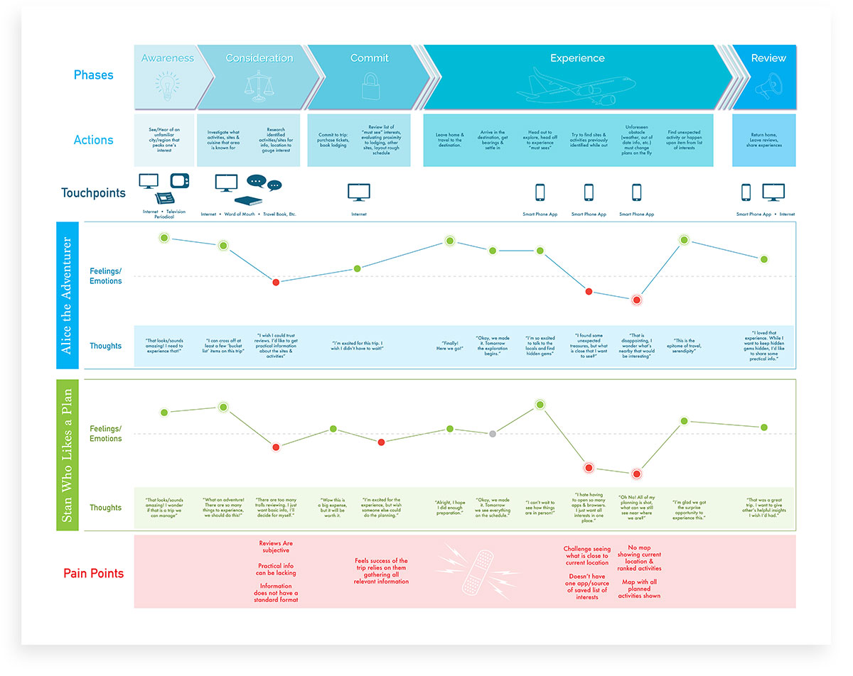
A Journey Map broke down the entirety of the travel experience, from planning through completion of travel.
Identifying major pain points:
• Unexpected circumstances
(weather, mechanical failure, etc.)
• Geographic Confusion
(way finding)
“This app is not working out for what we wanted to use it for, which is to move between locations on the map”
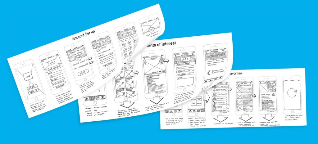
Sketching & Guerilla Testing
• Enabled quick adjustment of the processes.
• Honed in on a simple user friendly approach.
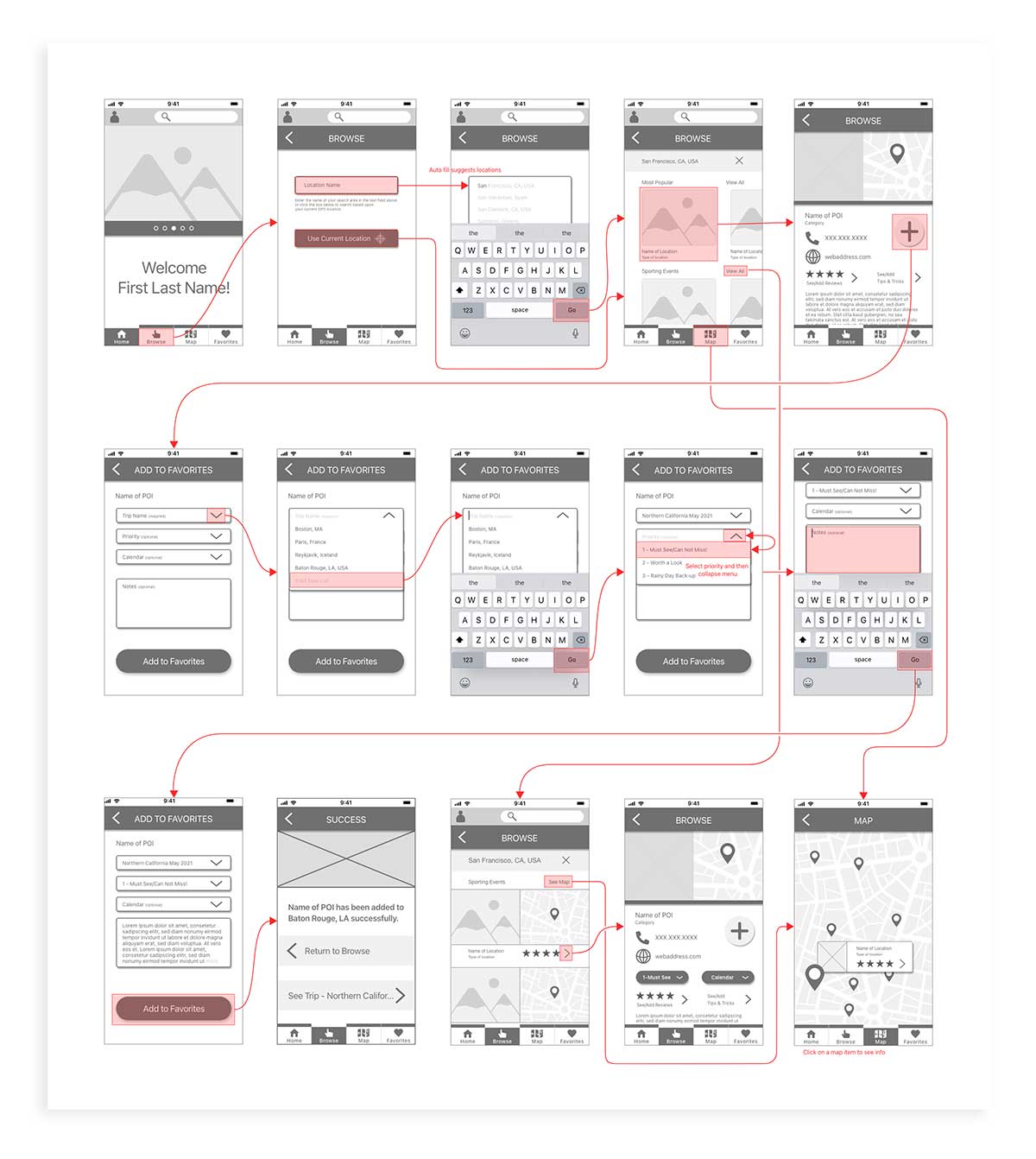
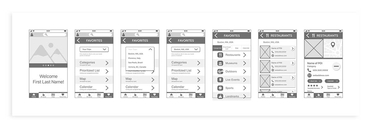
Wire Frames, Low Resolution Prototypes & User Testing
Sketches converted into Wireframes creating a Low-Definition Prototype.
An initial round of Remote Moderated User Testing illuminated existing issues and user concerns about how interactions ‘may’ perform:
• When conducting a search, spelling might necessitate an autofill function, to assist in finding desired results.
• Search results provided a list of categories. Test data revealed almost unanimously that this was an unnecessary and frustrating step.
Designing the User Interface
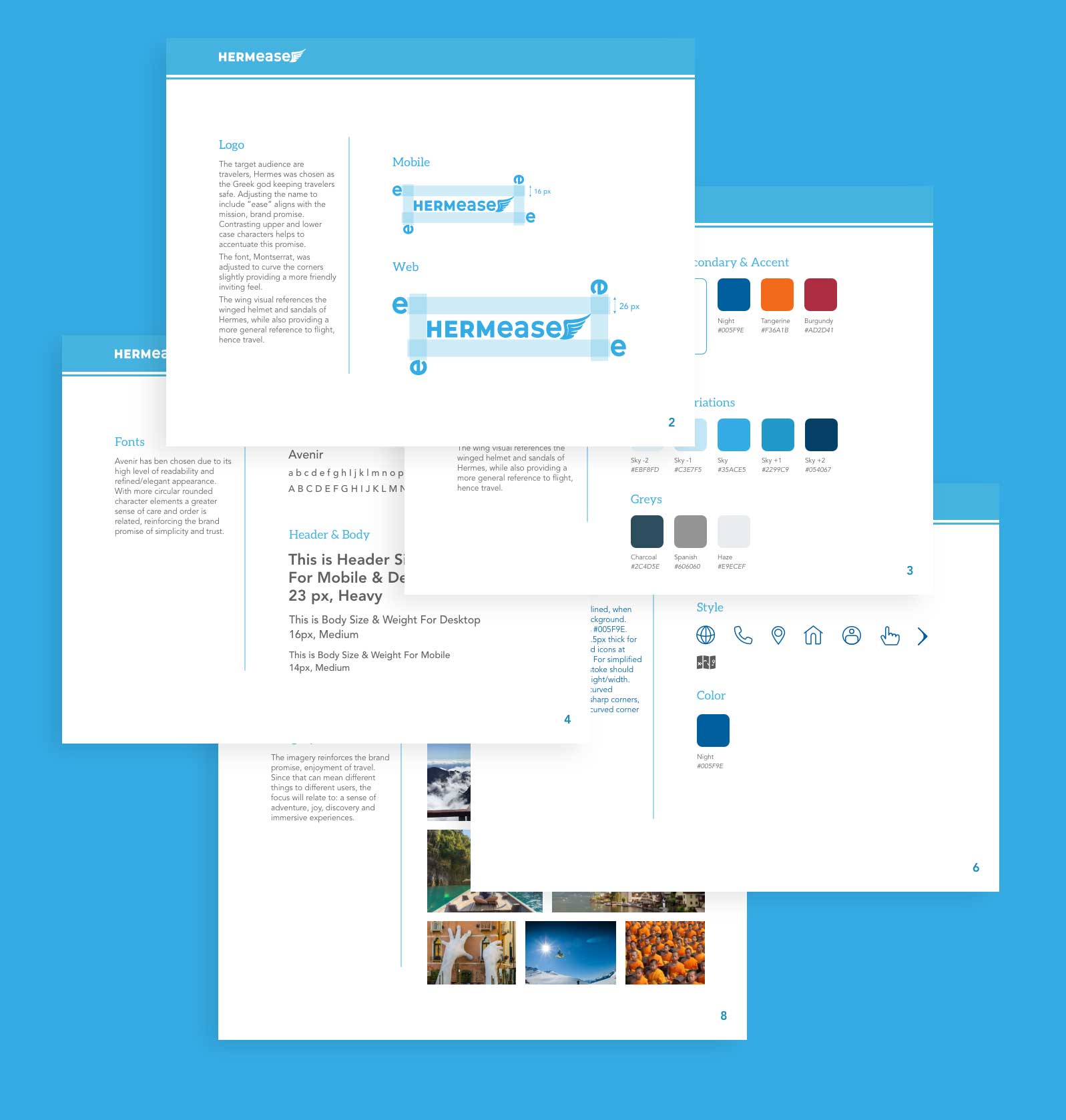
Determining the “Brand” (the promise made to users), “A helpful and easy to use product to support travelers”, was imperative to the creation of the style guide.
All elements were chosen to fortify this brand:
• The name and icon, a protector of travelers from Greek Mythology.
• A simple calming color palette.
• An elegant and slightly playful font.
• Easy to identify and use controls.
• Imagery (open/light icons and spacious non-congested photos).
• An open visually uncomplicated interface.
High Resolution Prototypes & User Testing
The Style Guide allowed focus to shift to the ‘nuts & bolts’ (intricacies) of specific screen layouts and their hierarchy, using data collected from previous rounds of testing.
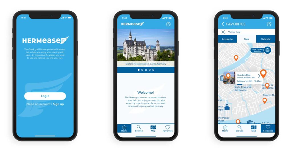
Contrary to past rounds of testing, feedback collected here focused on finite issues of appearance and the interactivity of individual screens.
For example:
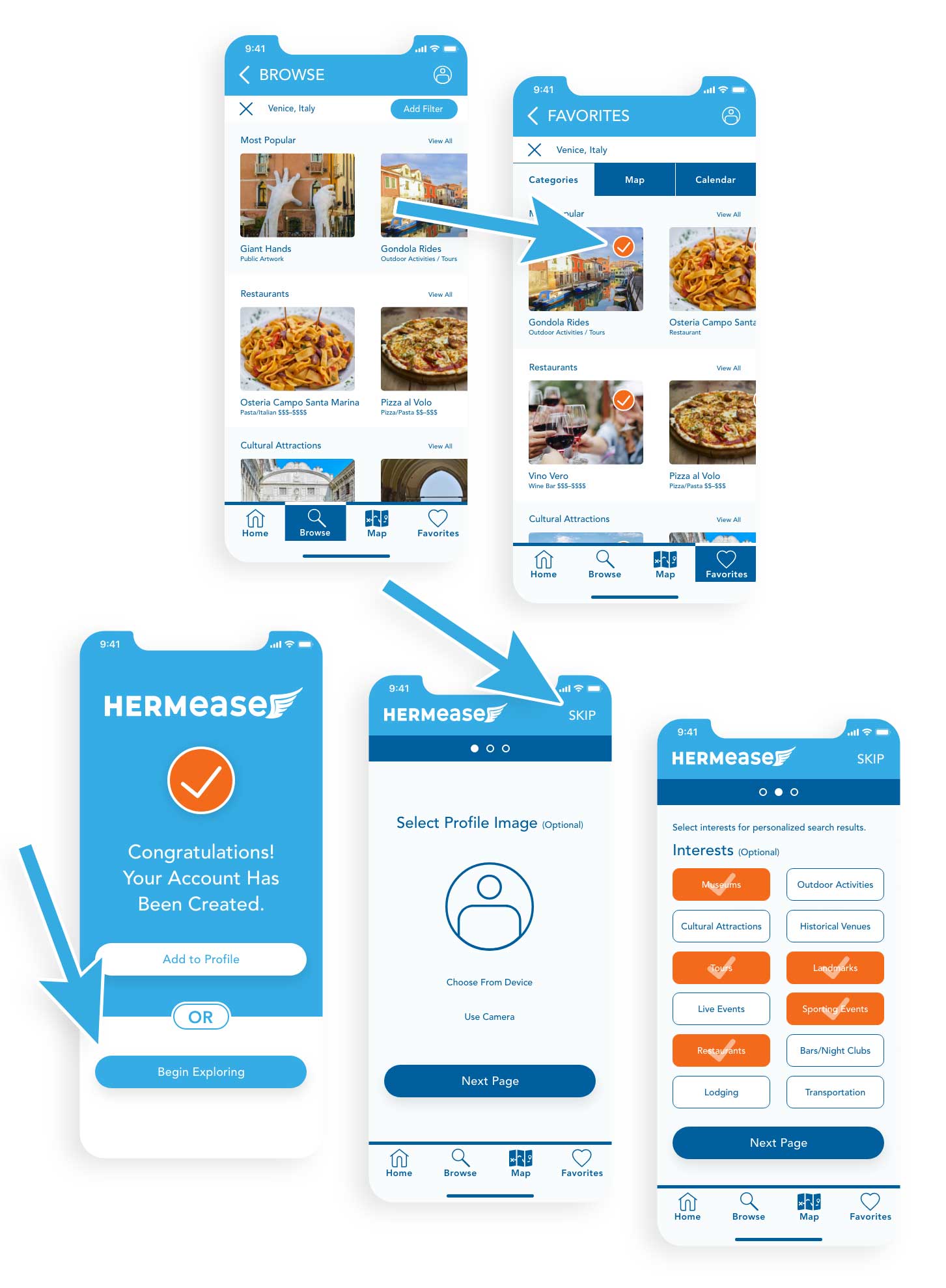
• Browse results and Favorites gallery have a very similar look. Users need a visual cue, showing what they’d previously saved.
• Many profile setup steps are optional, users did not realize this, others wanted to bypass those to utilize the product as quickly as possible.
Conclusions
Necessary tools have been added at user identified critical steps, in the planning of a trip, as well as accessing that saved information.
Essential functions, have been refined aided by multiple rounds of testing and iteration.
If given more time and resources towards this project, my next steps would be:
• Continue building out the specifics of the ‘search’ and saved resources, to streamline the tool and continue to evaluate the hypothesized functions.
• While user testing, a robust list of secondary features have been identified and compiled for potential inclusion after an initial product release.
• Build a website companion, for broader access and potentially easier viewing, when planning a trip (conducting broad searches).

Outcome & Results
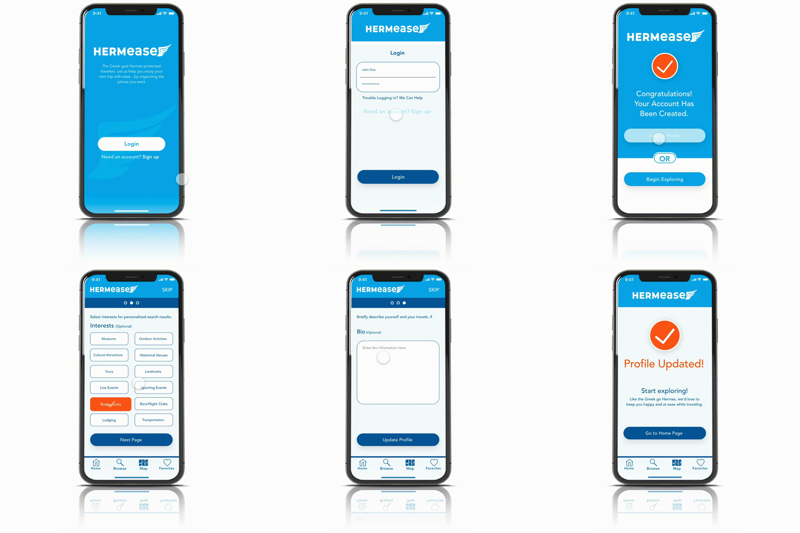
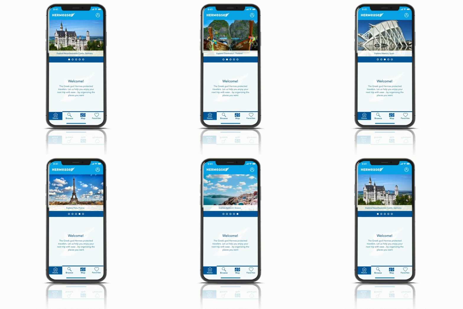
The current state of the Hermease Travel Application is a relatively refined prototype.
Lessons Learned
• Travelers want simplicity and organization.
• Unexpected circumstances can impose stress and anxiety on travelers.
• The fewer resources a busy traveler needs the better.
• Different choices, for displaying a saved trip, accommodates varied mindsets.
• Unique user needs/pain points were essential in expanding the scope of this project, however the ability to identify the shared experiences, was essential to keeping the Hermease project on track.


