A joint venture between Tangible AI (an artificial intelligence company with the mission of supporting socially oriented groups increase their impact) and Finetune (leading educational software company), to produce an Artificial Intelligence assisted application for expanding the reach of educators.

The Project
Take a well thought out educational software concept, with a healthy background of research, development and testing, and made a portion of the User Interface tangible. Solidify a piece of this complex product, creating a focal point for discussion and planning, towards the holistic goal of moving forward through agile (incremental) steps.
Roles & Responsibilities
• UX Design • Research
• UI Design • Research Synthesis
Team
James Porter, UX Designer
Sarah Machicado, UX Designer
Allison Jin, UX Designer

The Problem
Since 1980 critical thinking and writing skills have steadily declined in K–12 students in the U.S.
Academic writing and the critical thinking skills required for prewriting preparation are invaluable in preparing for all aspects of adult life. Whether attending college or immediately entering the workforce it is imperative to develop these skills, equipping individuals to better succeed.
• 70% of low-achieving writers are in grades 4-12.
• 50% of high school graduates are unprepared for college-level writing.
• 38% of those in the workforce are aware of not being good writers.
• Federal assessments in the USA showed a fall in students since 1980 in writing and reading skills.
• A lack of writing skills is one of the most common complaints of hiring managers.
• Deficient writing skills limit students’ overall academic performance in K-12 — and leave them under-prepared for higher education.
• Widespread deficiency in critical-thinking skills contributes to the devolution of society (e.g., acceptance and spread of post-truth discourse).
• Because large numbers of students/people have underdeveloped writing and critical-thinking skills, they are susceptible to misinformation and, therefore, to propagating untruths.
• Critical thinking and writing skills are not currently evaluated by the standardized tests used in public schools to evaluate students’ learning.
• Teaching critical thinking, for most students, requires one-on-one direct discussion with an educator. Currently public school teachers do not have the time or resources to dedicate the time required to teach critical thinking and prewriting techniques to their students, on an individual basis.
Users
Teachers (the focus of this agile exercise)- Create, conduct and participate in critical thinking exercises. Desktop and mobile interface.
Students – Participate in lessons via an SMS/text based interface (to combat the technology gap).
Researchers – Data collected can be used to support future educational solutions and assist in the development and augmentation of future iterations of Artificial Intelligence. Desktop and mobile interface, similar to Teachers.
Scope & Constraints
• 3 person UX Design team.
• 4 week (10+ hours/week per individual) assignment.
• Joining a project in process, necessitating rapid familiarization with the goals and previous efforts.
• Concentrate on the Teacher user group and that relevant portion of the interface.
• 1 weekly check-in meeting with the principles, to update progress, gather feedback and address any questions/concerns.
• Deliver tangible research data and usable assets, for the fluid continuation of this project, after our commitment ends.
The Solution
Support the ‘prewriting’ exercises that directly assist students’ preparation towards writing. Direct conferencing, between teacher and student, has been shown to be one of the more effective approaches in teaching critical thinking/prewriting. By automating the early portions of critical thinking/writing lessons, freeing up time for the high value one-on-one interactions later in the process expands the reach of teachers by maximizing their time.
Assist
• Teachers are provided a platform that can initiate the critical thinking thought process for students.
• Initially, through game/problem solving scenarios mainly directed by the program, then progressing to assignment specific prompts in an AI moderated chat.
Support
• Throughout the lesson, the A.I. notes characteristics of individual students.
• Data is collected on overall effectiveness as well as how compelling certain prompts are at initiating dialogue from students of different learning abilities and personalities.
• Eventually, there will be an open resource of lessons, for educators to contribute to and draw from.
Synthesis
• Finally, a direct conversation between student and educator results in a usable and well formulated outline
• This better equips the student to write a well crafted and thoughtful essay.*
*By ultimately providing an SMS/text based interface for the students, this product promotes a level playing field for all, combating the technology gap created by more advanced interfaces.
The Process
Our team of 3 UX Designers joined approximately 12 months into the project. Proposals for the project had already been submitted to competitions for funding. Previous teams had worked towards the formulation of scripts and prompts to support specific writing assignments. However, the User Interface was still in the concept/conversational state, between the three principles.
Project Plan
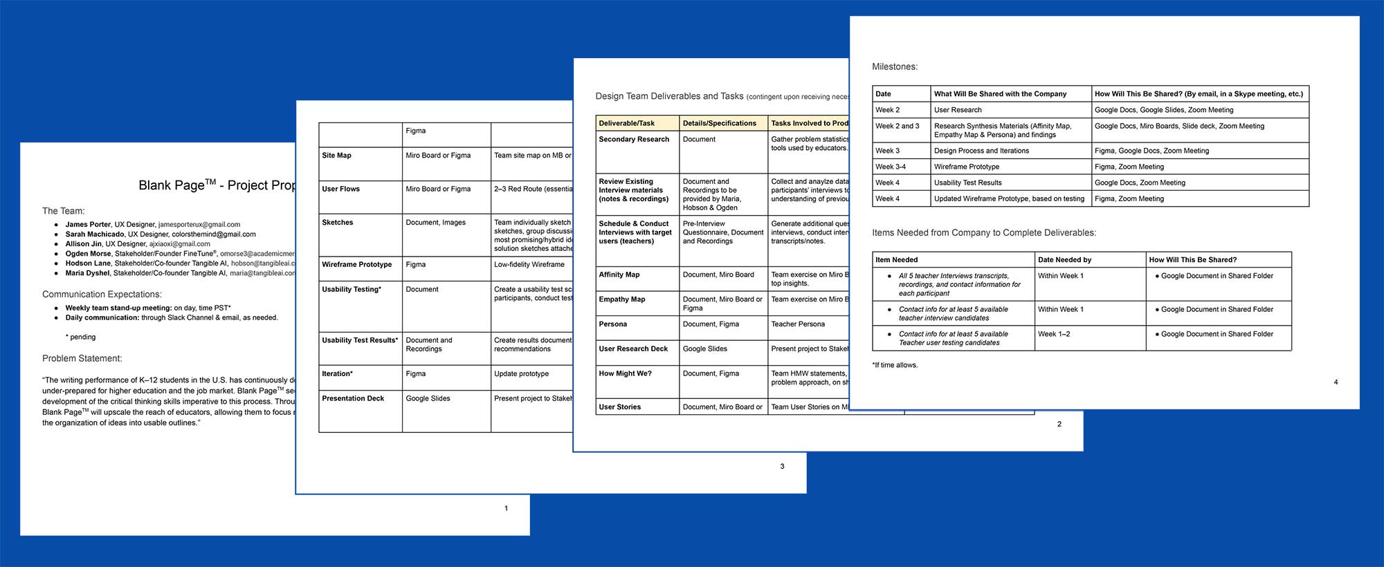
Due to the short timeframe for our contributions to this venture, our first course of action was the formulation of a Project Plan.
Through discussions between our UX team and the three project principles (Maria Dyshel, Hobson Lane and Ogden Morse) we quickly determined that with the sheer size of the proposed project, our best approach was to target one of the three user groups. As the process will ultimately be initiated, controlled and overseen by teachers, they would be our focus. We set quite ambitious goals, with the caveat that some of the later steps may need to be sacrificed to deliver solid, well founded and thoughtful results, at the culmination of the month.
Secondary Research
Some data had been collected and synthesized by previous UX designers, so our first step was to acquire and evaluate that information. While we were presented with some good data, we determined that lacking direct recordings and other documentation presented two challenges: generating a broad understanding of the teacher user group and context into how the previous UX Designer had reached specific conclusions. Conducting an additional round of interviews and secondary research provided a clearer view of the issues, concerns, perspectives and needs of teachers.
Interviews & Questionnaire
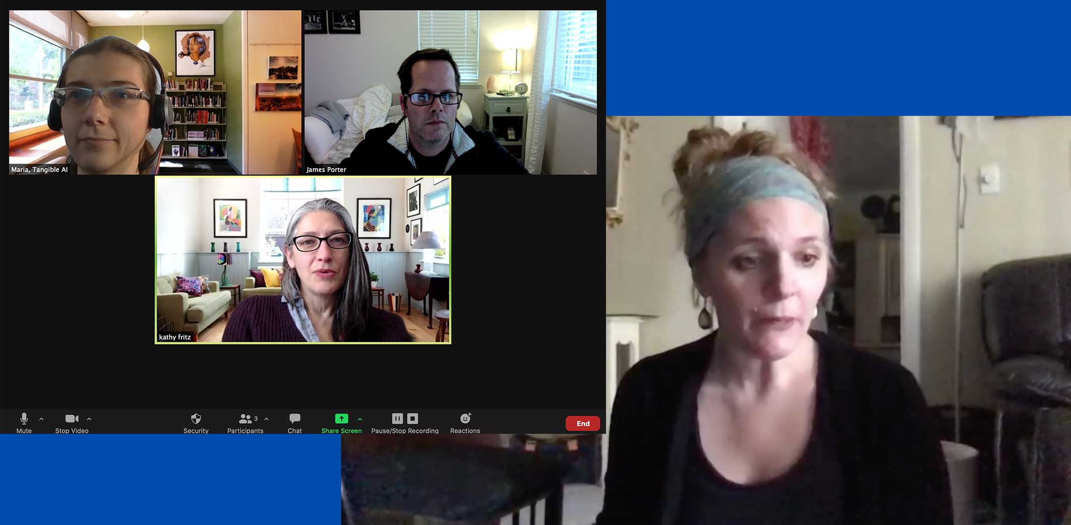
In order to maximize our time, we send a questionnaire to all available interviewees prior to our conversations, for background. Then two of us conducted an interview each while combining previous research with our own secondary research, while the third focused on two additional interviews.
Data Synthesis
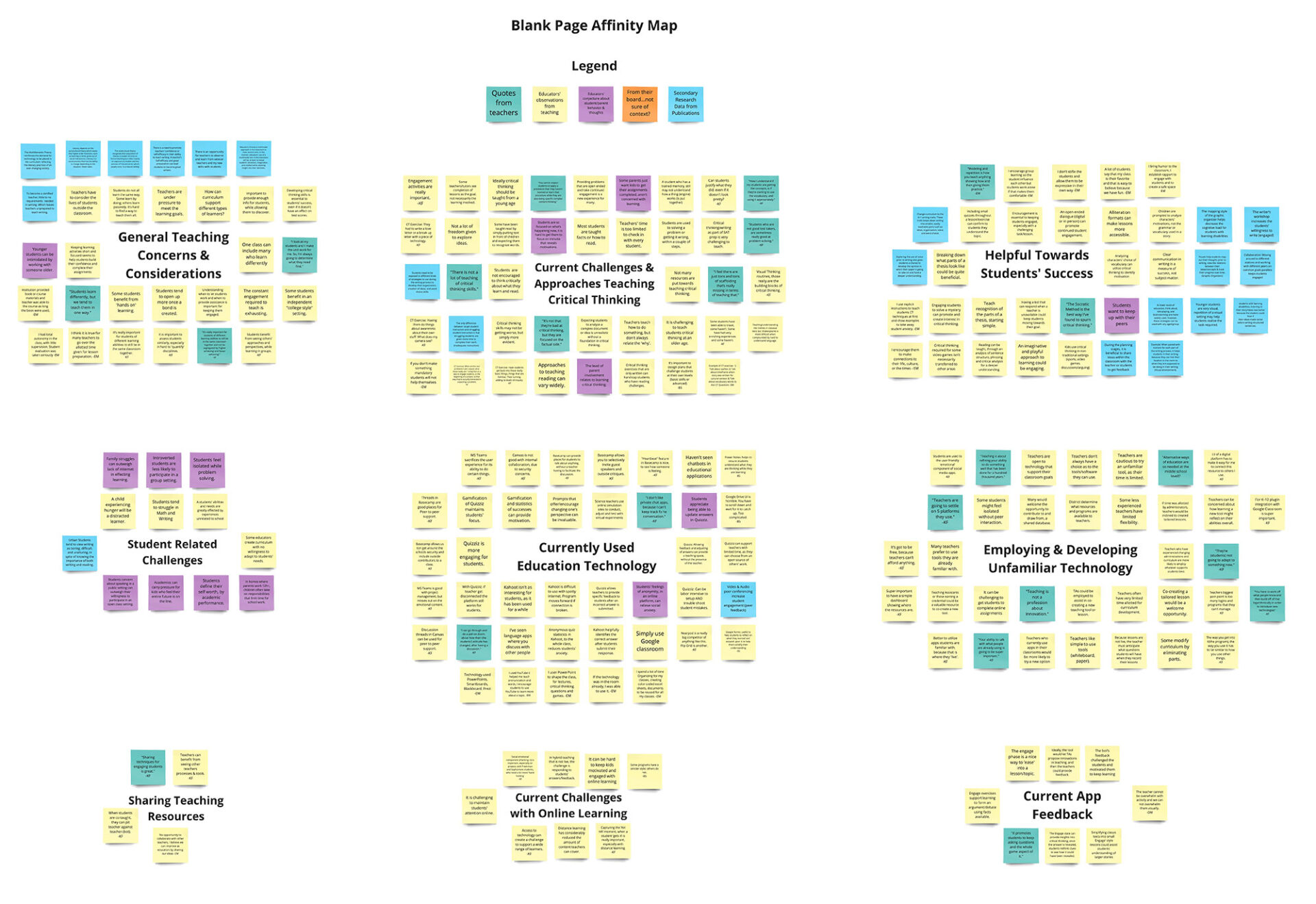
Once data was collected from all sources, the first step of synthesizing this pool of information was the creation of an affinity map. With all data points in one place, groupings were identified, revealing patterns. Repeated and interconnected items illustrated a hierarchy of needs, goals, frustrations and perspectives.
With this information more clearly defined, our team created an empathy map, to illustrate what teachers, see, hear, feel, think, say and do.

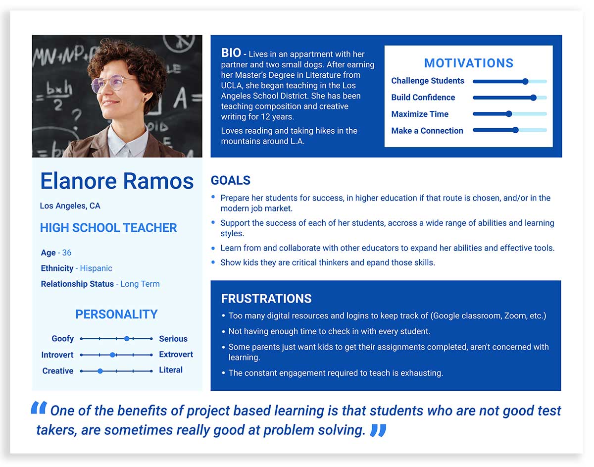
Coupled with the user persona (a fictitious representation of this user), these will continue to be invaluable moving forward throughout the project. They will ensure the target users remain at the forefront of any design decisions.
Findings
• Teachers are overwhelmed by expectations & requirements of time and required benchmarks.
• Most teachers are compensated for only a fraction of the time required to formulate and adapt curriculum.
• Teachers don’t have time or capacity to learn a completely new program/software.
• Current curriculums do not focus on teaching critical thinking and writing.
• Young people use critical thinking and writing skills in non-traditional settings such as sports, video games, online social interactions, and social media.
• Students tend to open up and be comfortable once a good rapport is established.
• Introverted students are less likely to participate in a group setting.
• Reusing or sharing curriculum can be an invaluable resource, for the time it can save.
• Most classrooms contain a wide variety of learners at different levels. It is invaluable to meet each where they are, providing enough information for progress while allowing them to discover.
Takeaways
• The interface must present a good amount of information in a way that is not visually overwhelming.
• Teachers should have an overview of individual lessons, where students progress and current status is easily identified.
• Choosing when to participate in the A.I. moderated chat with students is invaluable, to maintain momentum and trust.
• Students are willing to put in the effort to gain a deeper understanding and learn when they are engaged and encouraged.
• As students are grouped by the A.I., based on previous responses, being able to send the same prompt to multiple students could maximize the teachers time.
Ideating
Once data was organized into usable resources, a comprehensive list of “How Might We…?” statements was created, to clearly address the goals and needs of the three user groups. This list was consolidated, to prioritize where our team would dedicate resources for the remainder of our assignment, the teacher user group.
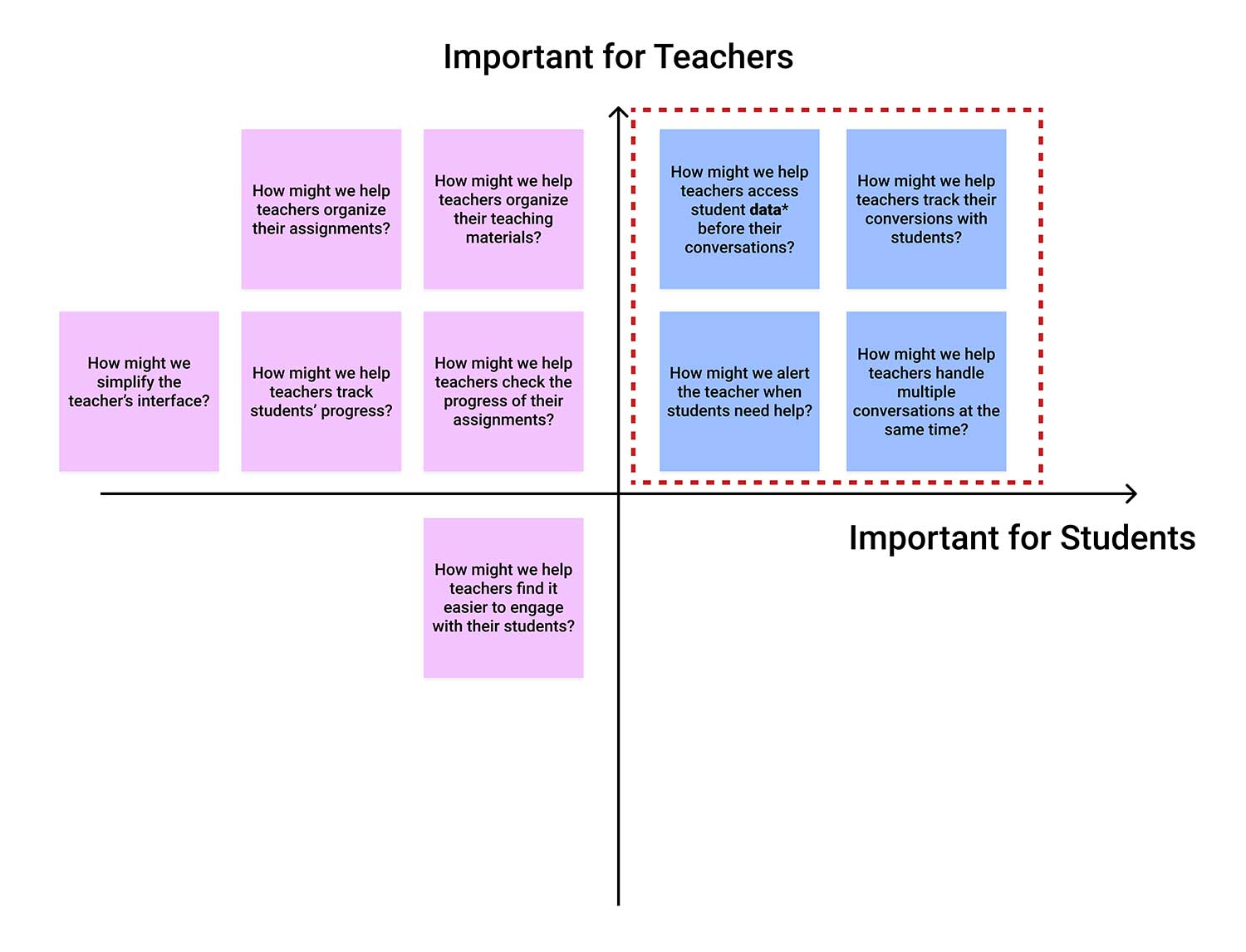
Focal points were:
How might we…
…help teachers track students’ progress?
…alert the teacher when students need help?
…provide teachers access student data, before and during their conversations?
…help teachers track their conversions with students?
…help teachers handle multiple conversations at the same time?
Pivot Point
During our second weekly check-in/meeting with the principles, it was determined that our remaining two weeks would focus on the creation of the teacher user interface. Potential time spent on a journey map and multiple user flows and user testing, would be dedicated this new objective.
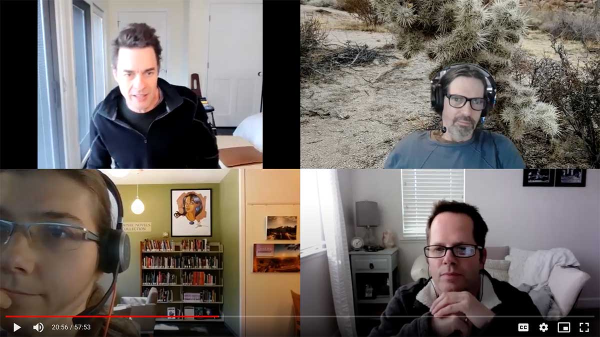
While ambitious, our new goal was to deliver a tangible (if rough) prototype for future user testing. Not only could this evaluate the solutions we proposed in the current iteration, but facilitate discussion and ideation, for how to most productively move forward.
Sketches
Normally, our next step would be to determine the sitemap structure and how a teacher traverses that to accomplish the most valuable tasks. However, as some of the functionalities of the interface have yet to be determined (for example: if early iterations will include a shared database of lessons, etc.), we decided our best course of action was to abbreviate the process.
Instead, we identified a couple of essential ‘user flows’, the most useful functionalities for the specified user. These were determined to be, how the teacher oversees a class/lesson and what the interaction between the student, A.I. and teacher looks like.
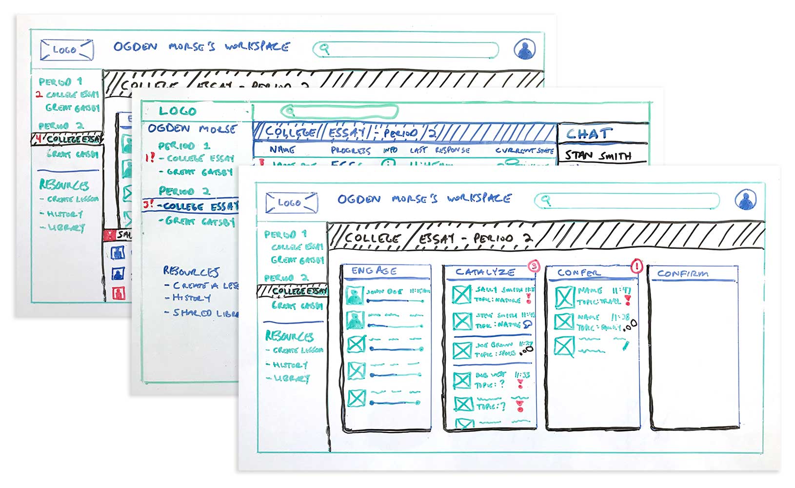
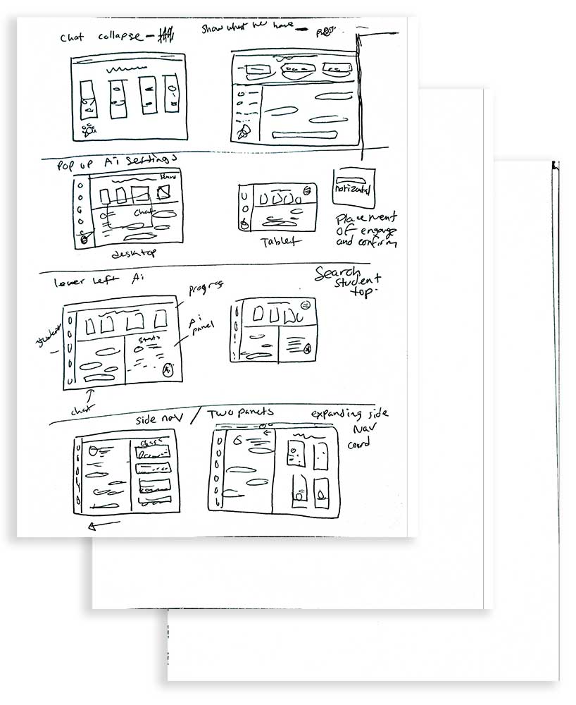
Towards this goal, the three of us first initiated the ideation process by sketching individually.
Takeaways
We met up to critique, evaluate and determine how to best maximize our time, combining the ideas we’d each sketched out. Some really great divergent ideas came out of this ‘siloed’ sketching.
This led to three distinct layouts: a Card Layout, a KanBan Layout and a Message Board Layout.
Wireframes
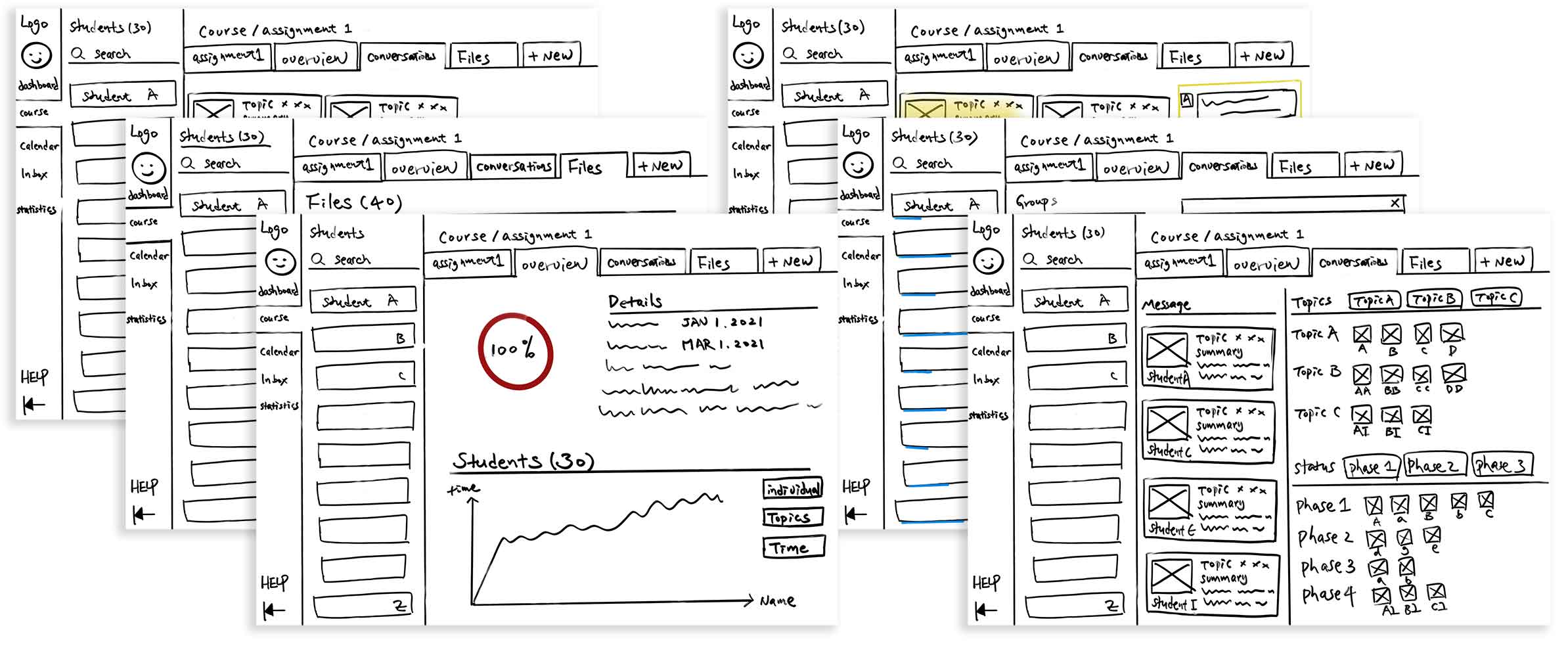
The sketches, and ideas generated from them, were developed into digital wireframes. This continued the process of ideating the look and feel of key elements. While placeholders were used for the assignment specific scripts and some imagery, each design was resolved beyond a typical ‘rough’ wireframe, to evaluate the benefits and possibilities of each.
Card Layout
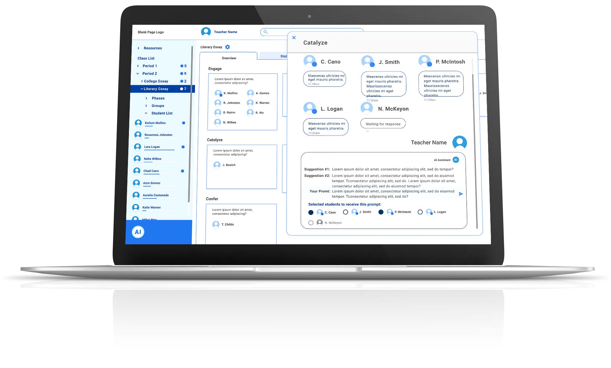
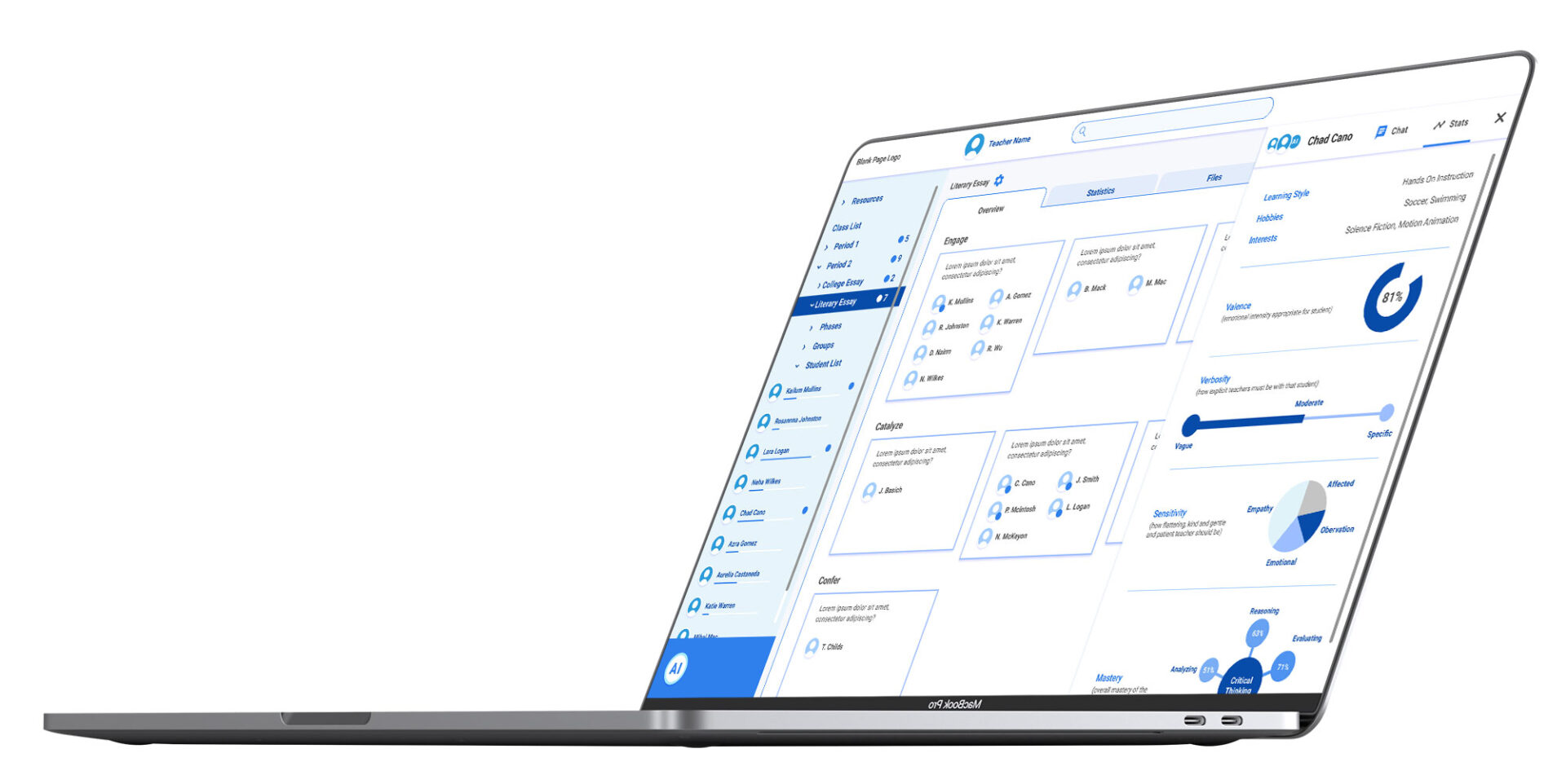
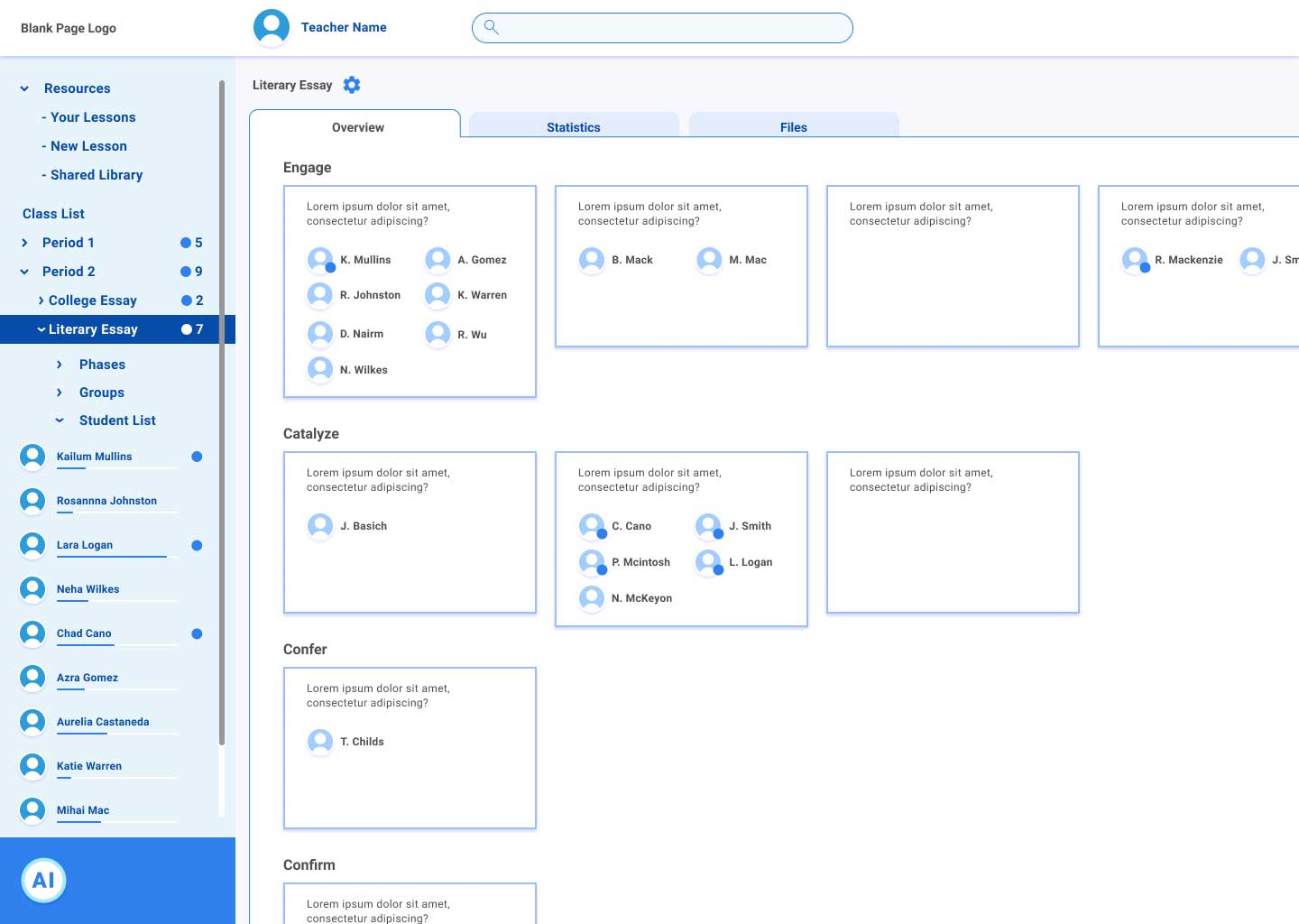
This approach separates the four phases of the lesson in horizontal rows. Groupings within each phase shown within that row. This layout doubled as the main user dashboard, with the content space (bottom-right 3/4) populated by the selection made in the left navigation panel.
KanBan Layout
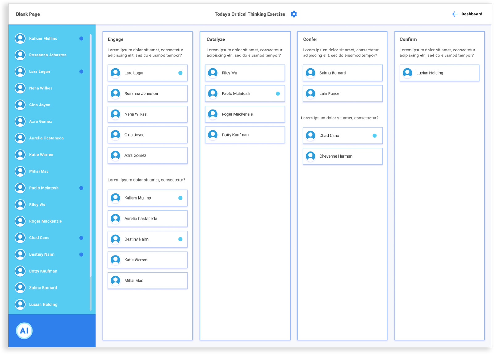
Using a vertical column structure (known as a ‘KanBan’ layout), each of the four phases occupies an individual column.
This design was ‘lesson specific’, necessitating the creation of information architecture and design of an outer “dashboard”, providing the pathway to the lesson view.
Message Board (Slack-esque) Layout
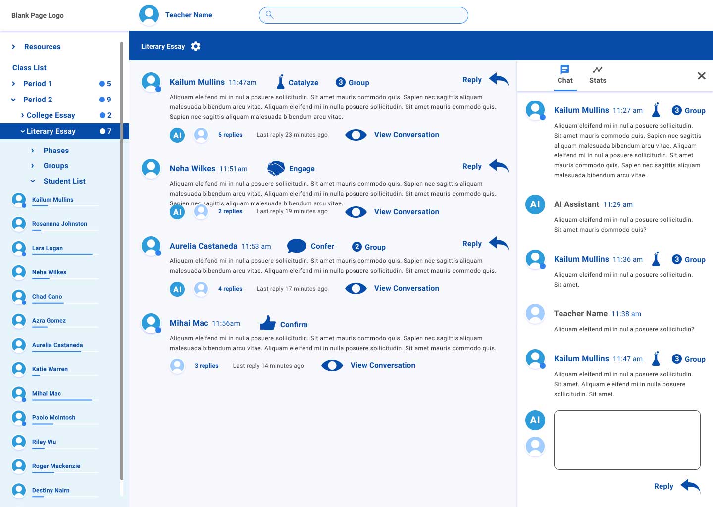
The final layout was chosen to test a hypothesis put forward by one of the principles, that a scrollable message board (similar to Slack) might be the best approach. Like the card layout, this design employed a left navigation panel, with dropdown sections, to act as the dashboard as well as individual lesson page.
Wireframe Iterations
At the final weekly check in before our commitment concluded, it was determined that the ‘Card’ and ‘KanBan’ layout were the most effective approaches, delivering information in the most visually manageable format.
It was decided to forgo the possibility of user testing one of these, in order to iterate both with our remaining time.

Takeaways
Card Layout:
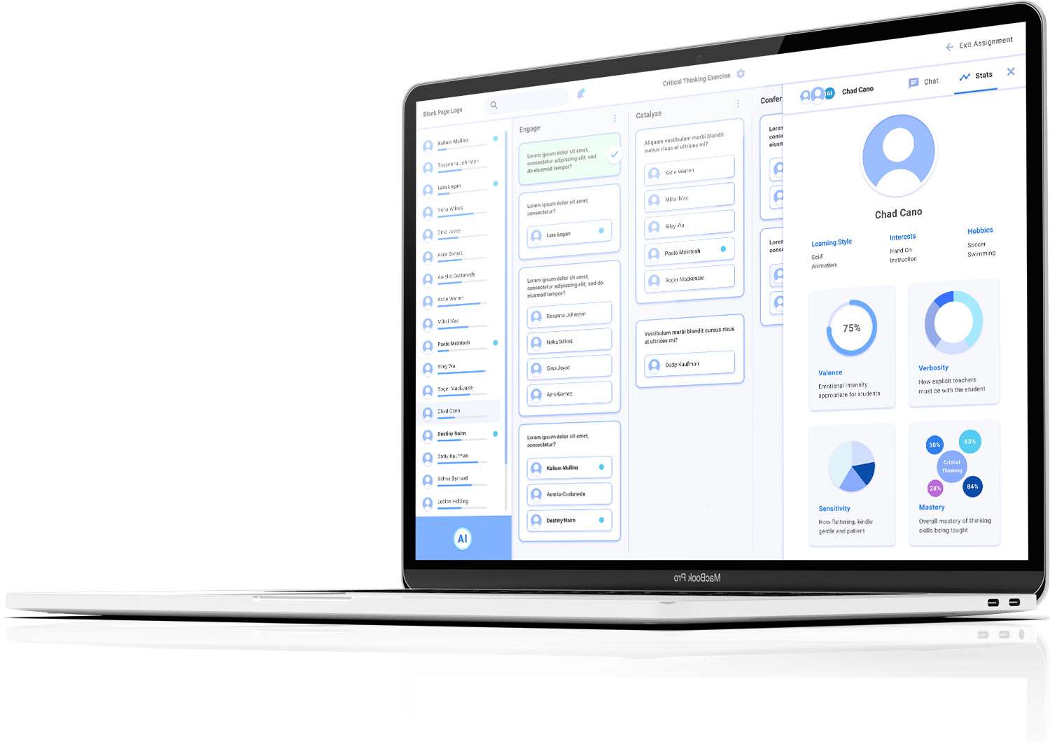
• Build out what the display of A.I. gathered and disseminated statistics would look like.
• Show an option for what the multi-channel chat could look like.
KanBan Layout:
• Develop the initial screens (dashboard, etc.), building out the information architecture.
• Ideate the multi-channel chat.
Message Board Layout:
• Visually complicated.
• Not useful in overseeing the class’s progress through the lessons’ phases and groupings.
Conclusions
Upon completion of our fourth week on the project, we were very pleased to be able to handoff two testable prototypes. To maximize time, our team met at the beginning of our last week, to formulate a plan, iterated each of the two designs individually and met once more before the handoff, to organize and finalize the assets.
This approach, the result of limited time, had the added bonus of providing variations of the multi-channel chat, as well as the statistical display.
With functioning prototypes in hand, these variations can now be evaluated through user testing, to determine which avenue to pursue.
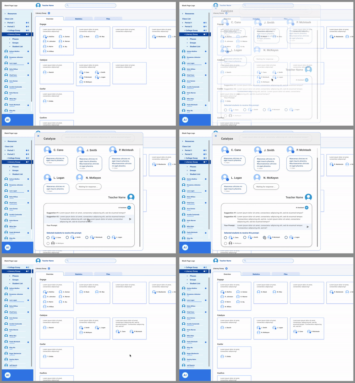
Card Layout
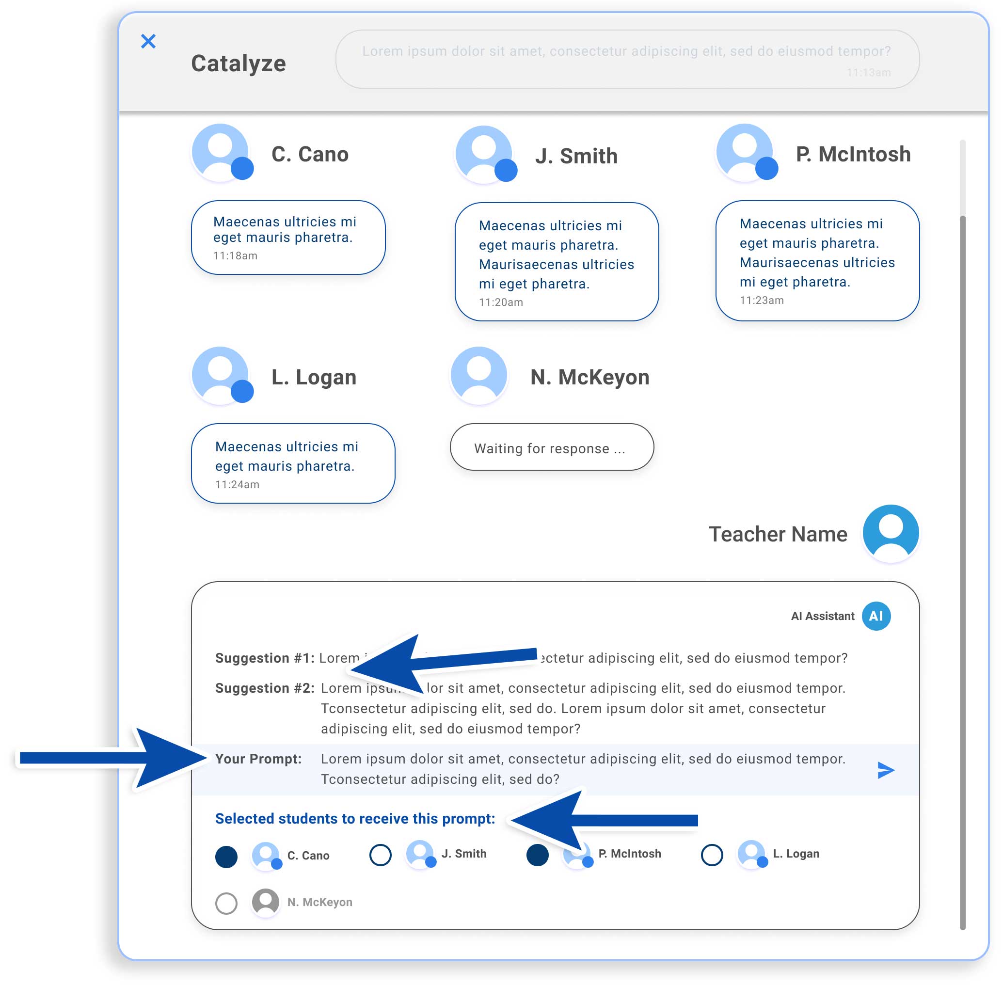
Work was continued, to show what the individual one-on-one chat and statistics display could look like, as well as a possible version of the multi-channel chat, including controls for:
• A.I. generated responses
• The teachers’ ability to choose those OR provide their own prompt.
• The teachers’ options for responding to one, some or all students with the same or multiple prompts.
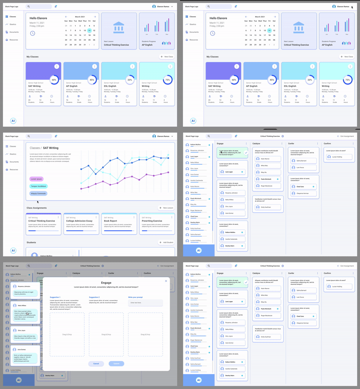
KanBan
This design was pursued to:
• Show an alternate approach to the multi-channel chat, relying on a ‘drag and drop’ concept, presenting some exciting possibilities.
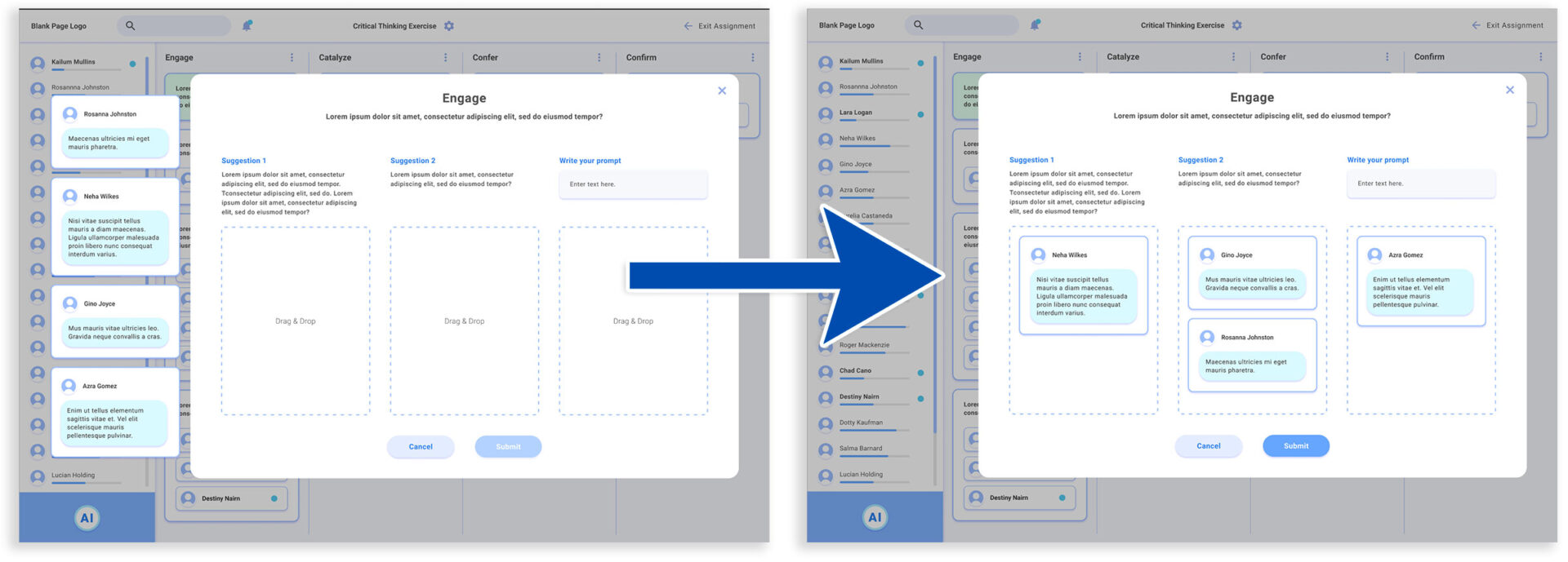
• Develop more of the teacher interface, to support navigation to the KanBan layout.
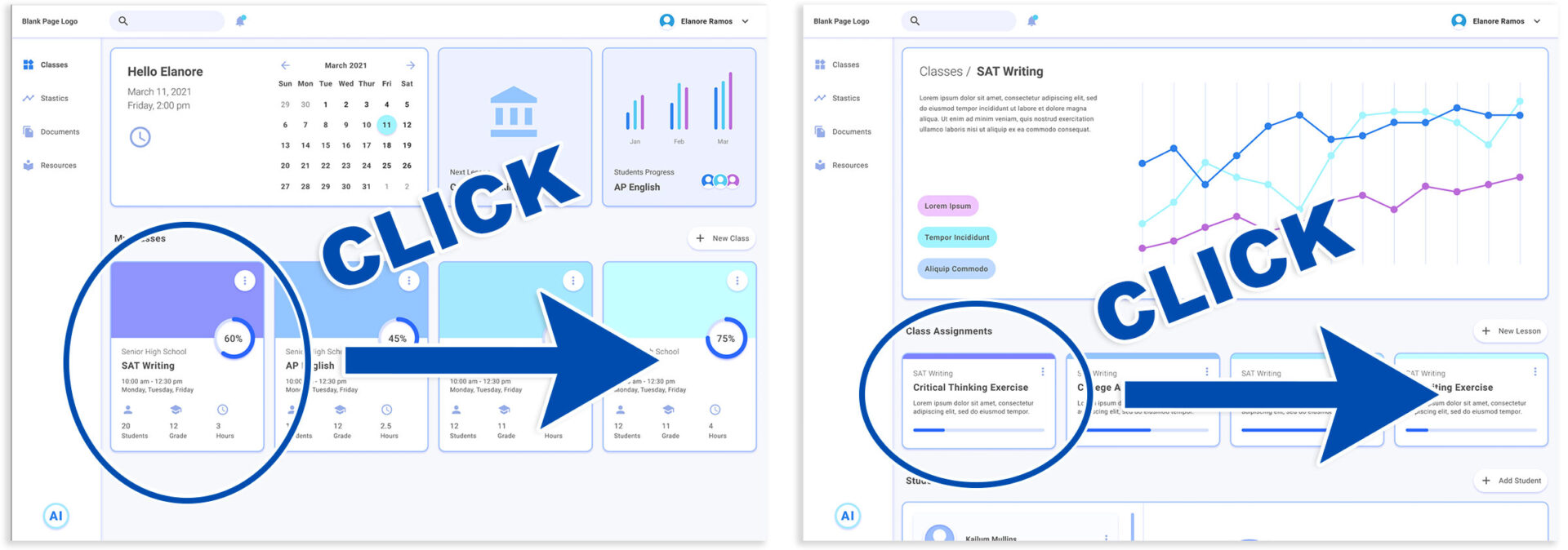
Outcome & Results
Ultimately, our contribution to the project was to pass along well documented and synthesized research of the teacher user group and the first iterations of the teacher User Interface.
The early iterations of this interface make tangible what had been primarily concepts, providing a concrete basis for discussion and iteration moving forward.
User testing will reveal which solutions are successful and which need adjustment or require an alternate approach.
Solutions such as the multi-channel chat were intriguing challenges to address. It will be interesting to see what the final resource looks like, if it reflects one of our teams two hypotheses, or something new altogether.
Card Layout
KanBan Layout

Lessons Learned
• Teachers’ time is invaluable. However, anything that saves time can not erode the trust fostered with students.
• A ‘one size fits all’ approach to teaching critical thinking will not work for different personalities and types of learners. Lessons must be adaptable.
• Many of the assumptions made by teachers about students (contained in our pool of data) may be accurate, but should be confirmed through student interviews and testing.
• Online resources can alleviate certain issues (ex: introverted students’ reticence to participate in front of classmates), but present others (ex: student engagement can suffer in an online environment).
Recommendation
“James lead a team of UX designers to create an interface for an innovative AI-based application. Under James’ leadership, the team created a full set of high-quality UX deliverables, from user interviews to high-fidelity mockups, in record times. Throughout the whole project, James proved himself as a great designer and leader, giving clear roadmap for the project at the start, aligning expectations and communicating barriers throughout the whole duration from the project. He also made effort to empower other team members, giving them opportunity to present their work and ideas. I really enjoyed working with James, and he’ll be an asset for any team he’s part of.“
Maria Dyshel
Co-Founder, CEO
Tangible AI, 2019 – Present


