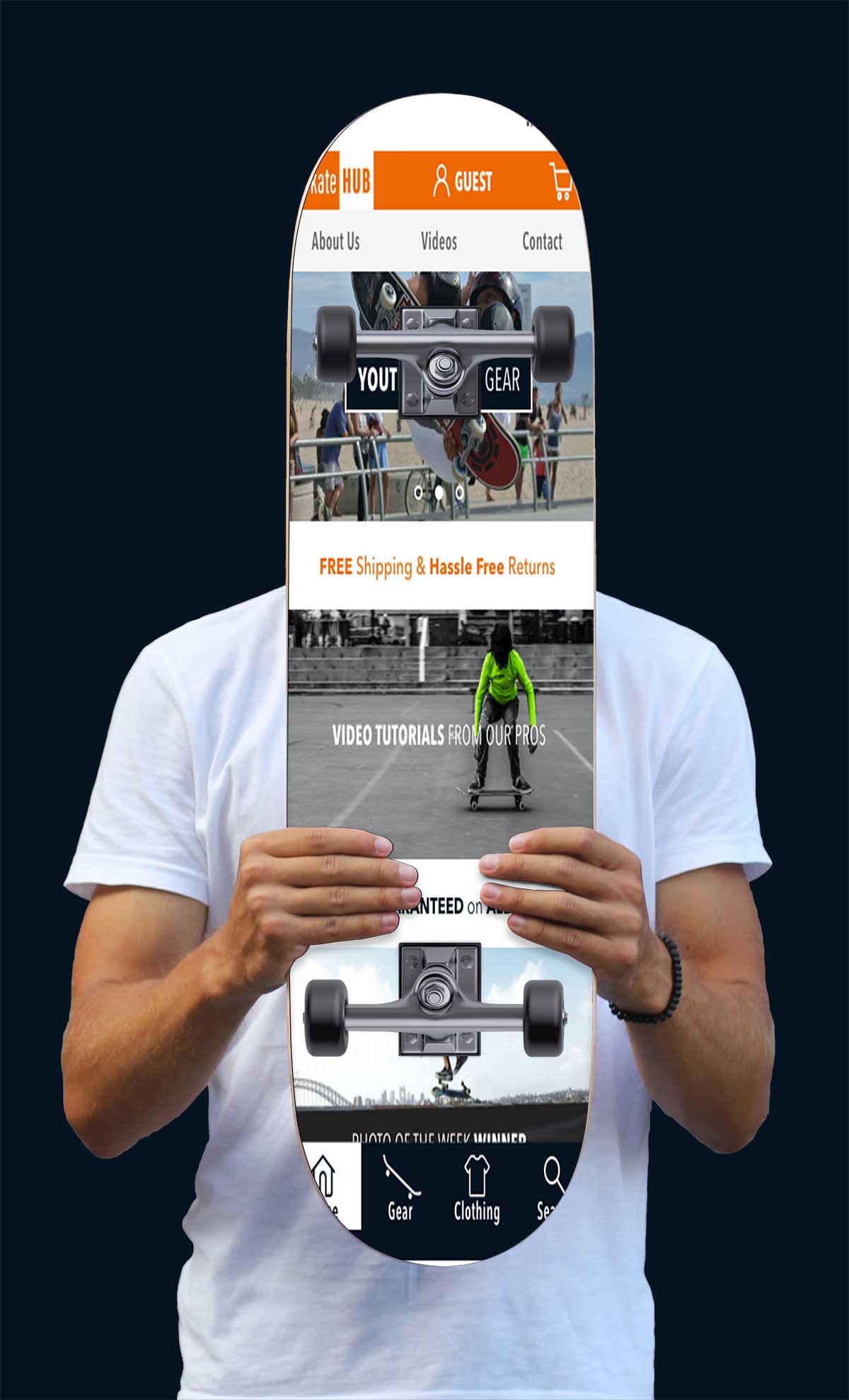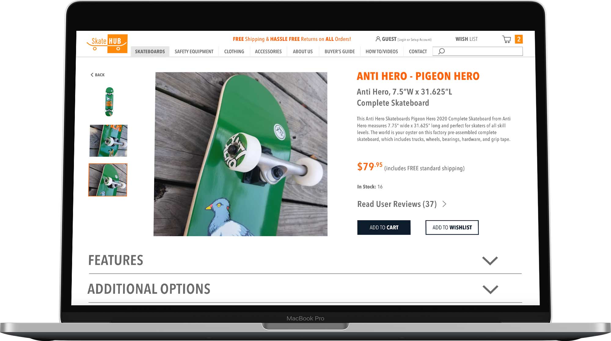
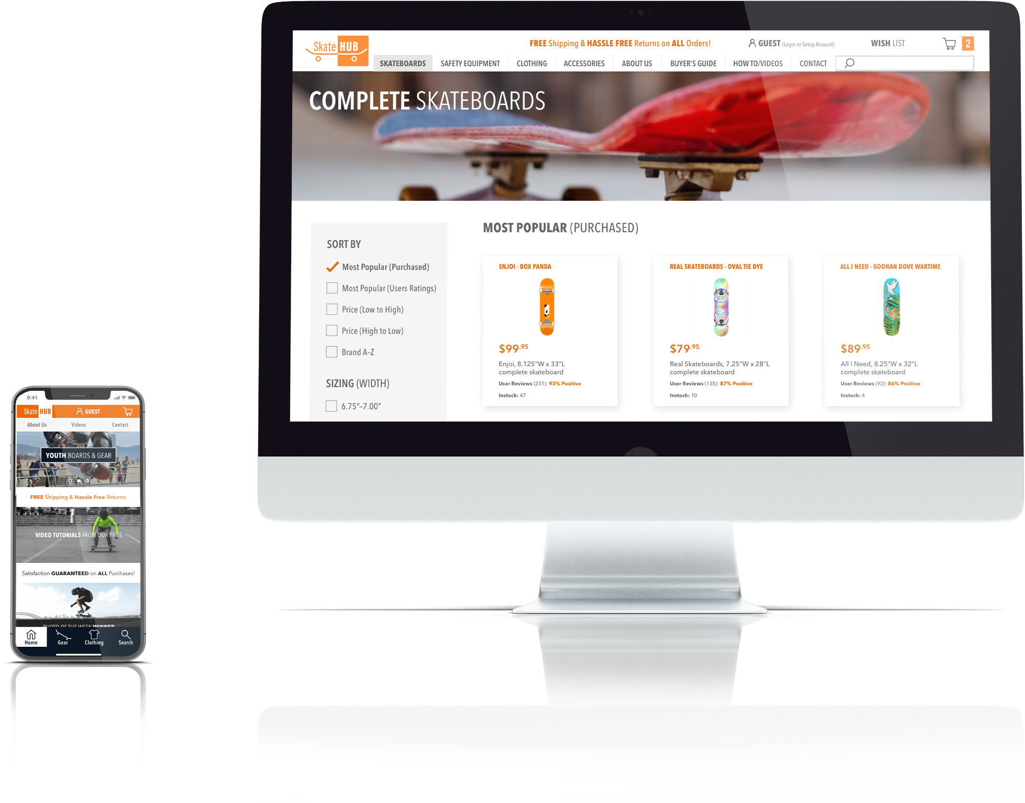
A fictitious e-commerce platform, who’s sales funnel issues need to be addressed on its desktop and mobile experiences.
Roles & Responsibilities
• Research
• UX Design
• UI Design
• User Testing
The Problem
This scholastic project presented a unique challenge: the main focus was to address sales funnel problems, however the online and mobile presence had to be created, as only a rough, one screen wireframe was provided.
The issues proposed for this assignment were: data showed 50% of the sites users open 7 product pages, but abandon the site without moving any to the shopping cart; additionally, 70% of users with items in their cart abandon the checkout process at the registration page.
Users
• Online shoppers looking to purchase skateboards and related equipment.
• Those unfamiliar looking for guidance and veteran users looking for specific products.
Scope & Constraints
• Develop the platform (as it was non-existent).
• Identify issues preventing sales conversions and add a guest checkout option (requiring email).
• 3 week project, 90 working hours.
• 1 person UX/UI team.
50%
Browse without selecting a product.
70%
Abandon before completing checkout!
How might we . . .
. . . provide resources addressing consumers’ needs, to put them at ease when browsing?
. . . instill trust, so customers feel comfortable purchasing from an unfamiliar retailer?
The Solution
A simple browse-to-purchase experience, providing resources to mitigate identified pain points.
A structure supporting easy exploration and purchasing, resources to assist in resolving product related questions, an accessible brand personality, and a sense of site security, cultivated consumer trust.
Effortless Shopping
• Simple, organized navigation.
• Easily identified search feature.
• Broad payment options.
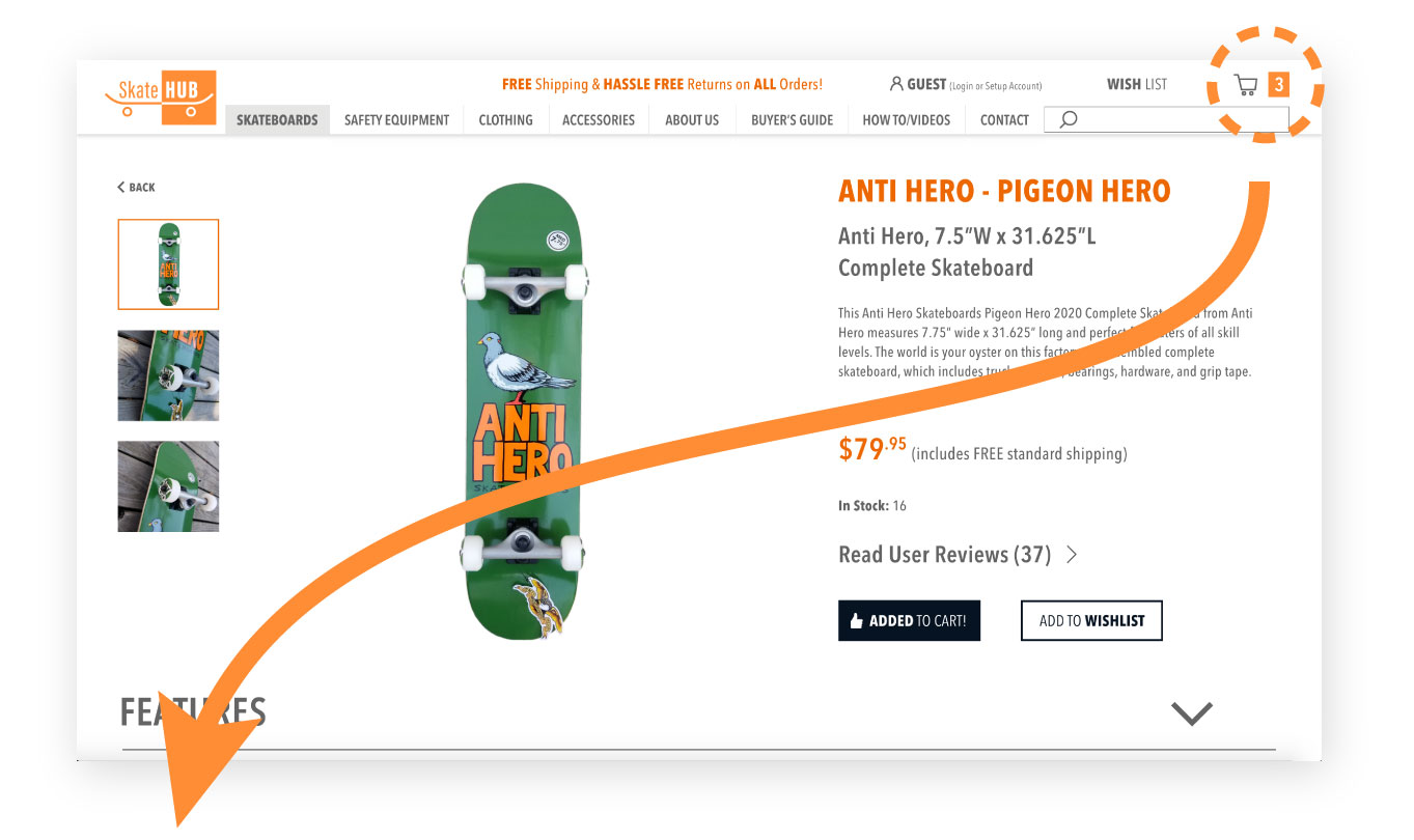

“I don’t like automatically being sent to the Cart page when I select an item.
Then I have to figure out how to get back to where I was, or restart a search.”
Customer Education
Informative resources where questions arise.
“It is frustrating when the company assumes you know their product. It’s beneficial to have information available (and obvious for first time users, like a clickable link with a pop-up) and not bother return users.”
Building Customer Trust
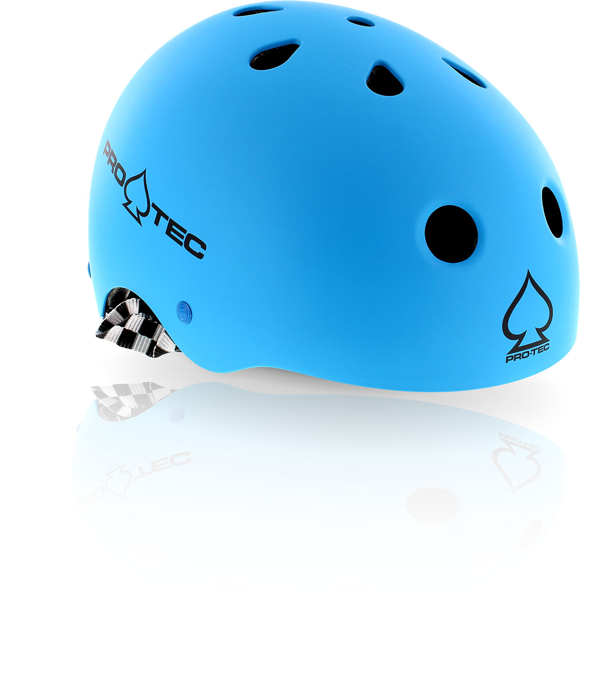
• Consumer Ratings & Reviews.
• Easy to find offer explanations.
• Videos showing the personality of the brand.
• Contests to reenforce a sense of community.
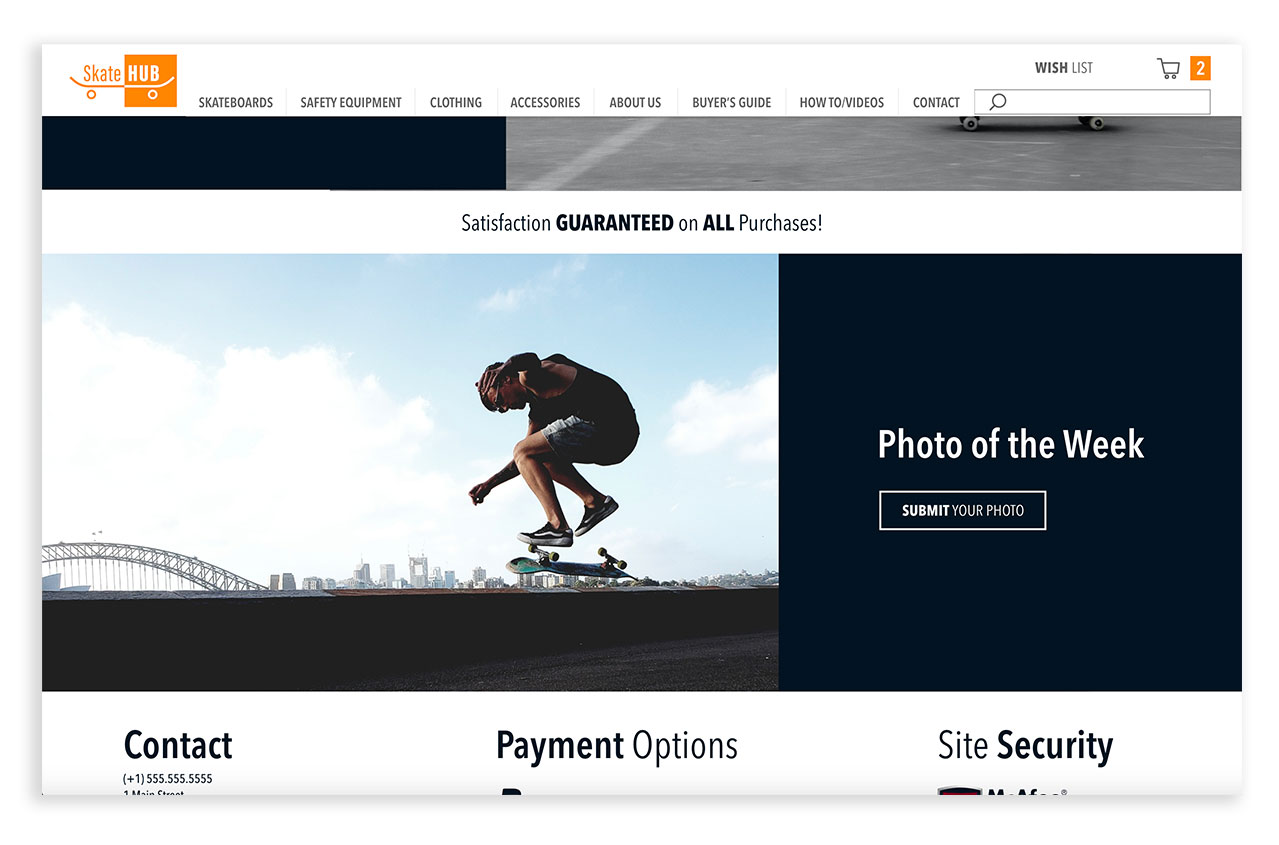
“I like the ‘Submit Your Photo’ part, it makes the site feel more personal, with more of a connection than, say Amazon. This makes me feel more ‘a part of it’.”
Peace of Mind
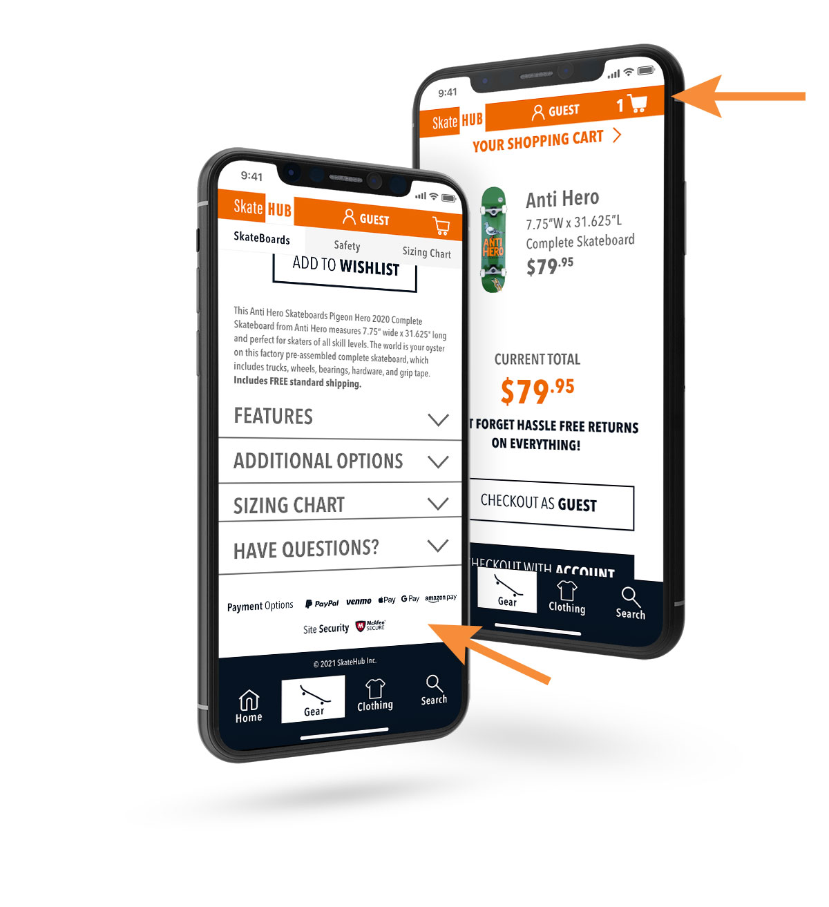
• Itemized cart displayed through checkout.
• Prioritize Users’ Security.
“When I’m starting to give you my information, I want to know it’s safe.”
The Process
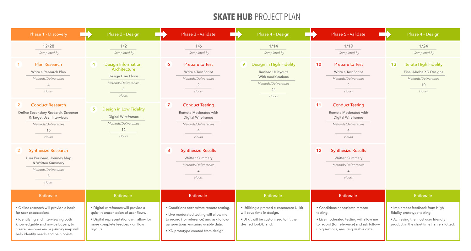
Create a Plan!
Due to the time constraints present (90 hours total), it was imperative to layout an overall plan for this project. The main focus of this project was to address a lack of sales conversions, on a fictional non-existent site . . . necessitating a quick platform build. While the creation of the User Interface was rapid (to get to the ‘meat’ of the assignment), it still required a certain amount of time, making the project plan even more invaluable towards:
• Helping me determine which processes and resources would provide the greatest return on (time) investment.
• Allocating appropriate time towards project phases and by association, the individual steps within each.
Secondary Research
Once the plan estimation was created, my first step was research. I started by identifying the demographics of the skateboard buying community and finding some basic market statistics.
• About 8.6% of America’s youth (those under 18) have ridden a skateboard in the past year…that is about 6 million riders.
• A majority of those skateboarding in the United States (77%) are male, with an average age of 14.
• A skateshop with an online presence can earn more that 3x one without, on comparable sales.
• The global Skateboard Market Size was expected to reach 2 billion dollars in 2020, forecasted to reach $2.4 billion by 2025. Street boards emerge as the largest product segment by far, outnumbering all others combined.
8 Million
Americans under 18 have ridden a skateboard in the past year
3x
Sales increase for skateshops
with an online presence
14
Average age of
skateboarders
Takeaways
• The skateboarding market is growing, street boards being the most significant sector.
• A well crafted online presence can greatly increase profits.
• A majority of skateboarders are males under 18 years old.
Competitive Analysis
Competitors, CCS, Warehouse Skateboards and Amazon.com were examined. How are products and the purchasing process presented, in relation to priorities identified during research?


Primary Action Items
• Provide complete boards priced with parts and basic shipping included, then choices to upgrade available.
• Guides, to help novices (or parents/gift buyers), for sizing and appropriate suggestions including a calculation tool, for the proper sized deck (height, shoe size, skate style).
• Guest Checkout and Create an Account options, with explanation of any fields (no Asterix) required when using “guest checkout” (email to send shipping update, etc.).
• Product page with info about shipping & returns and any offers for setting up an account. (Brief info with modal windows with more info.)
• “Compare” option to compile similar products to see side by side.
Secondary Action Items
• Sticky header with dropdown nav.
• Modal window shopping cart, for uninterrupted shopping.
• Expand filters placed on left side.
• Parts modal windows with adequate space between product cards.
• Offers: Free shipping on orders over a certain monetary level & % discount when someone starts an account (one time or perpetual?).
• Justify request for email (send shipping update, etc.) with opt in for promotional emails.
User Surveys
Following the competitive analysis, it was time to collect user feedback on individual experiences. Especially relating to what contributes to site abandonment, what resources can retain users and feelings about entering personal information (email, etc.).
Specifically, the questions I was looking to answer were:
• What are the major concerns for shoppers when browsing items online?
• What are contributing factors to providing comfort to online shoppers?
• When purchasing an unfamiliar product, what tools can assist the online shopper?
• Would it be helpful to shipping included, so users’ don’t feel ‘squeezed’ at checkout?
• Are users’ comfortable submitting email during guest checkout if it allows for shipping alerts?
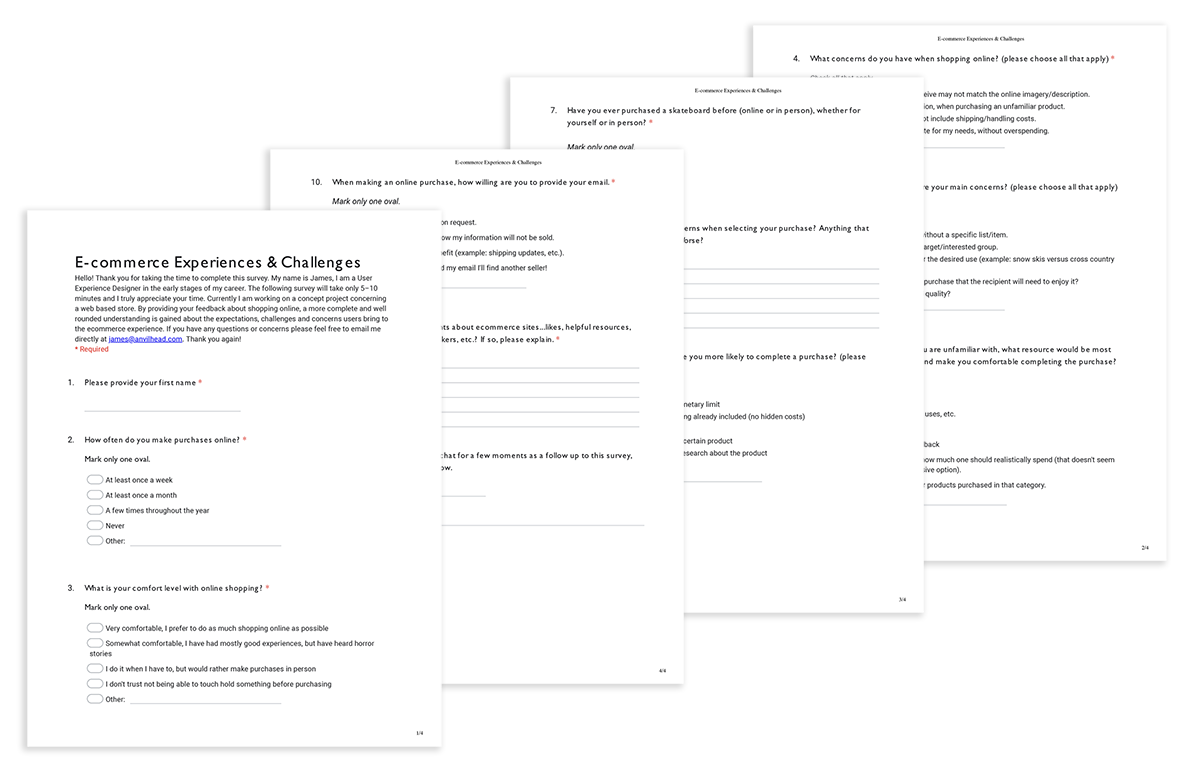
Takeaways:
• Many e-commerce shoppers retain concerns of security and trust, regardless of how frequently they shop online.
• 87% of respondents are skeptical if the quality of the product they purchase is accurately reflected on the e-commerce site.
• When purchasing a gift 92% are concerned about quality.
• Almost half of survey participants are frustrated by a lack of information while deciding on an online purchase.

Pivot Point:
• Many responses were submitted, however there were few participants that had skateboard specific experience, and only a couple under 18-years old.
• With limited time and access to the specific target users, what was the best approach to user interviews?
• Was data only from those purchasing skateboards or related gear and within the target user age relevant, for it to be actionable?
Frequent online shoppers were deemed acceptable for user interviews and prototype testing based on these factors:
• The issues to be addressed are relevant to most e-commerce sites.
• The young age of the majority of skateboarders, supports the assumption many receive parental assistance with purchases, while others receive them as gifts.
User Interviews
5 participants were interviewed, varying in age from 14–48, only one was an active skateboarder.
Focusing on e-commerce activity and expectations, I asked about experiences which addressed the following:
• What are the major concerns for shoppers when browsing items online?
• What are contributing factors to providing comfort to online shoppers?
• When purchasing an unfamiliar product, what tools can assist the online shopper?
• What caused skepticism or distrust of a site?
• What are challenges or frustrations while completing an online transaction?
• What are effective value proposition, providing motivation to complete a purchase?
• What are users’ concerns when submitting email during checkout?

“I look at reviews. If I haven’t tried a brand before, I mainly look at the bad reviews…because bad reviews show why a person didn’t like it. I find that helpful.” – Seiko I.
Research Synthesis
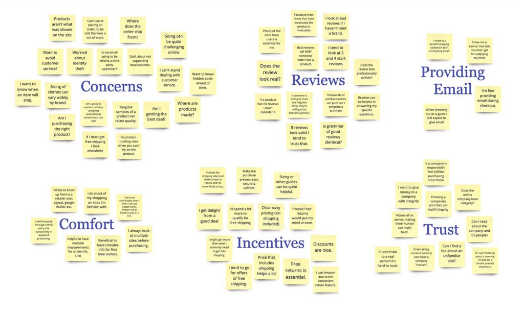
Patterns in user interviews and survey data were revealed utilizing an affinity map.
The Affinity Map exposed the most pressing (shared) topics related to users’ concerns:
• A lack of trust, especially on unfamiliar sites.
• A need to feel comfortable in order to use a new site.
• What can (or can not) be effective incentives to shoppers.
• Specific reasons Consumers’ utilize reviews.
Takeaways:
• Most start from a skeptical perspective and need convincing to trust a site they’ve had no prior experience with.
• Showing personality (introducing the actual people at a company and other efforts) can help an online retailer’s appearance change from impersonal to accessible.
• Many want to know all necessary costs (shipping, tax, etc.) before committing to a purchase.
• Reviews provide a sense of comfort, by giving explicit insights into product when one does not have the opportunity to hold it in their hands.
Collected data was complied to create a user persona, Skater Steve. Along with Steve’s empathy map these were invaluable in maintaining a focused perspective, moving forward.
Skater Steve’s concerns/goals/needs:
• Maximize his limited budget.
• Find quality equipment, appropriate for his size, weight & skill level.
• Purchase from a vendor that supports him, and the skate lifestyle.
• Free and easy returns if something doesn’t meet expectations.
• Insight into products, from experts and customer reviews.
• Quick, easy site to get what he needs and get back to skating.
• Site security, wether using his or a parents’ payment method.

Wire Frames
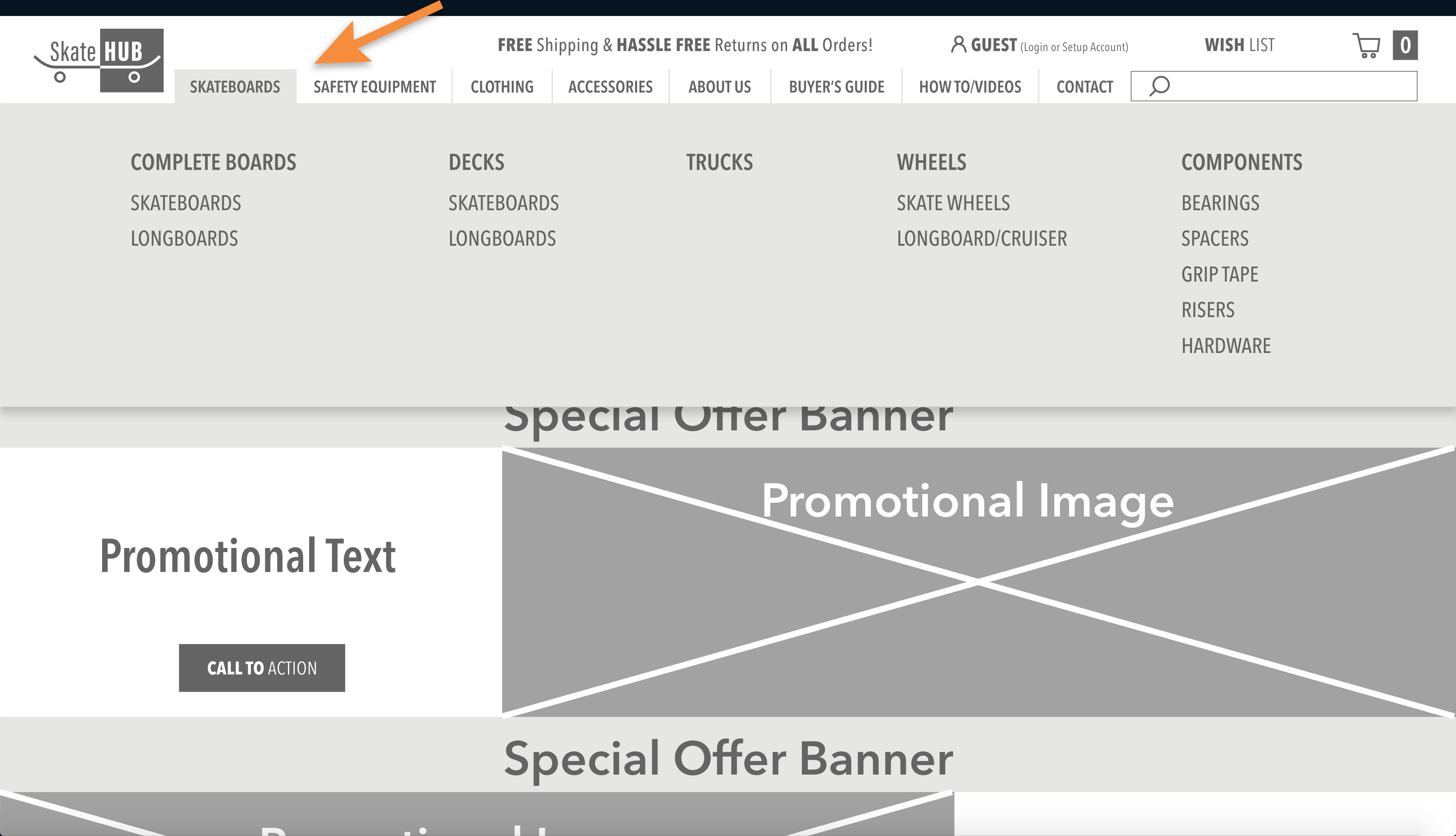
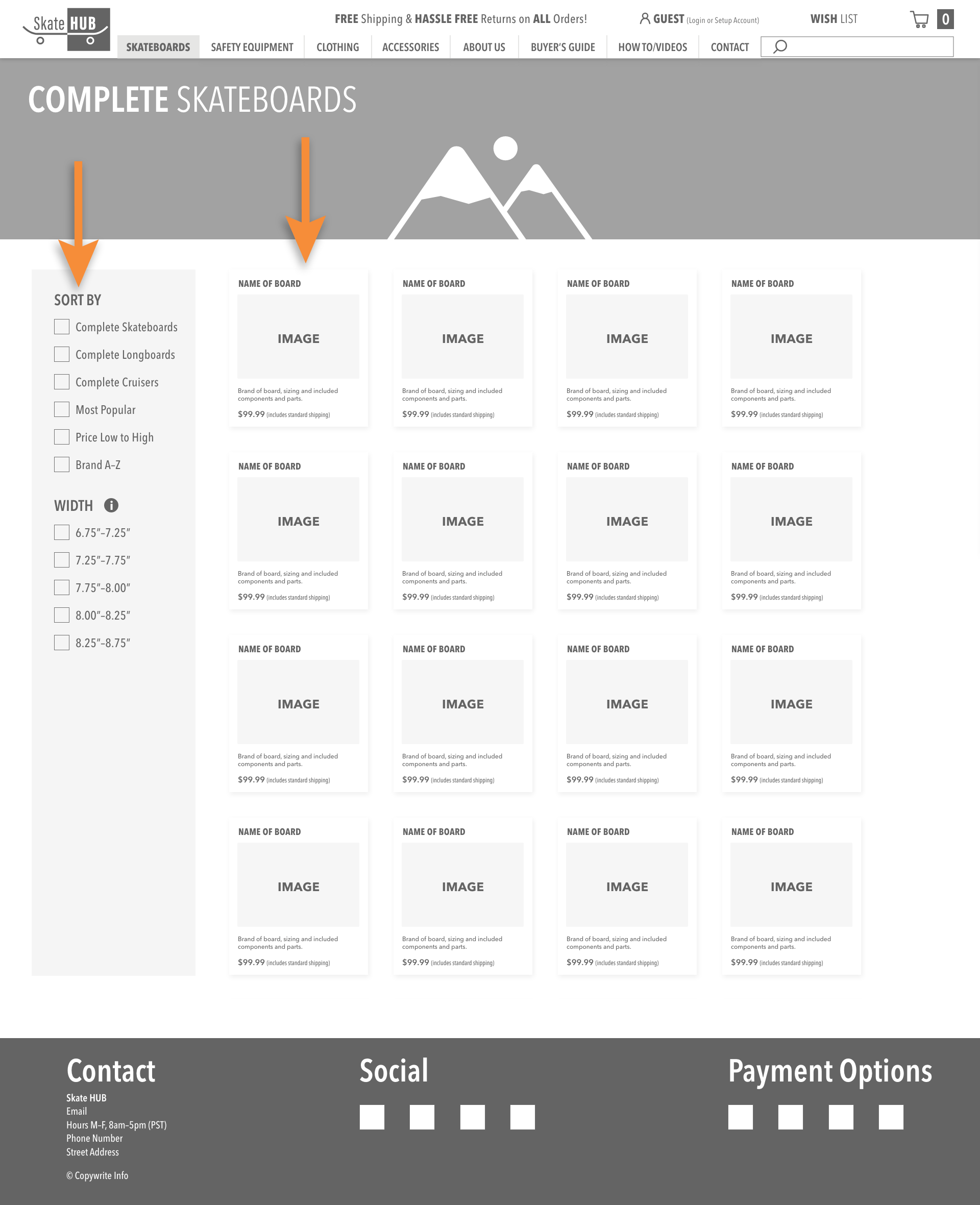
Due to time constraints I drew heavily from existing online retailers to create a low resolution design, as a first attempt at fulfilling as many of the Hueristic Principles as possible.
Specific focus was given to:
• Layout of screens and product cards adhering to common e-commerce protocols (Heuristic #4: consistency and standards).
• Modal windows and multi-level dropdown navigation was chosen to support Heuristics #3 (user control and freedom) and #7 (flexibility and efficiency of use).
Information Architecture
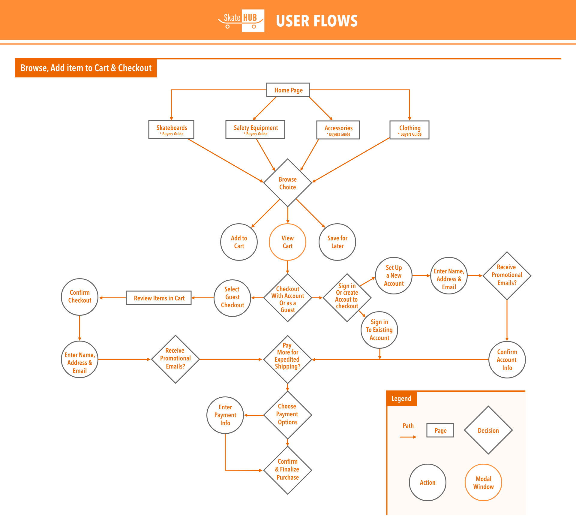
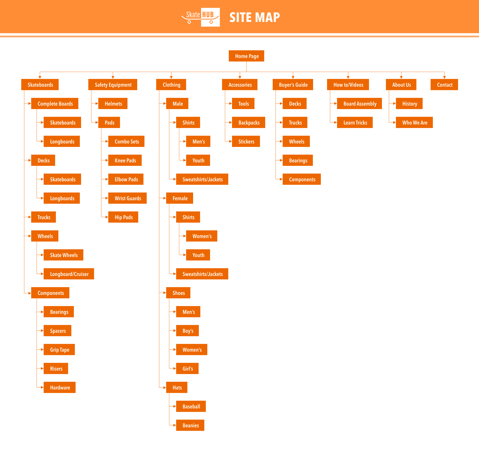
By addressing the information architecture needed with a clear user flow and site map, the wire frame was built out enough to test some of the areas identified as problematic.
Wire Frame – User Testing
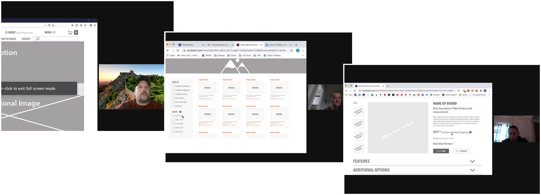
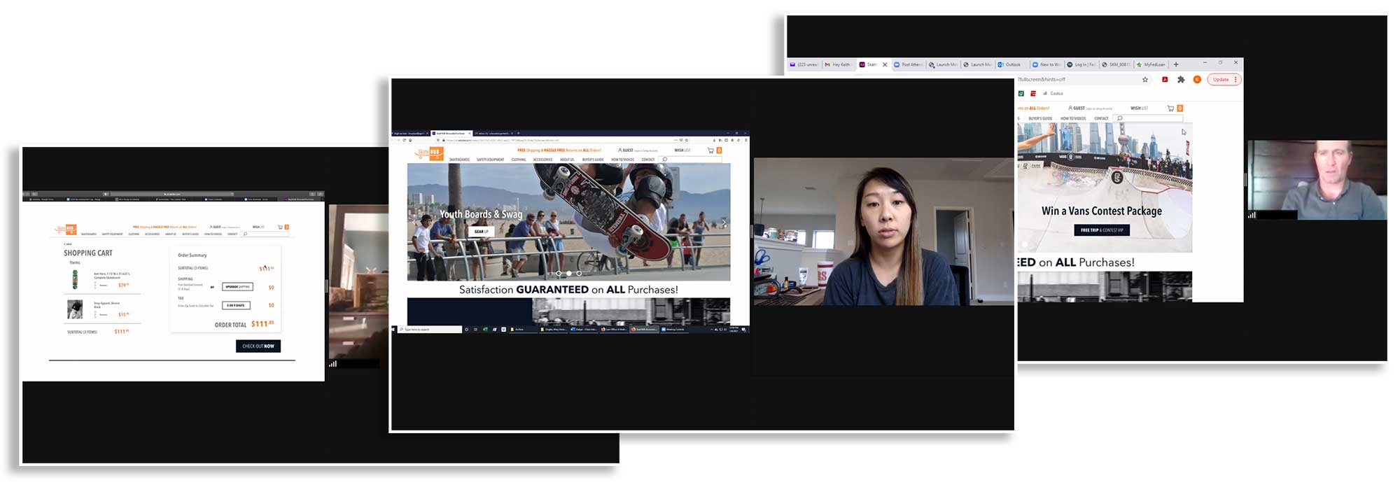
Using remote moderated user testing, 5 users were given a set scenario, to test design and organizational assumptions.
Participants were tasked with finding an appropriately sized fully assembled skateboard and completing the purchase without setting up an account. Non-skating participants were provided height and weight for the individual they were purchasing for, allowing me to assess the location and how identifiable informational resources were.
Takeaways:
• Identifying the locations/screens where informational resources were most necessary (Heuristic #2 – match between system and the real world).
• Clarity of verbiage is essential to belay skepticism of promotional offers.
• Filters, employed to refine browsing results, benefit from simplified wording.
• Unless clearly shown, site security is not assumed.
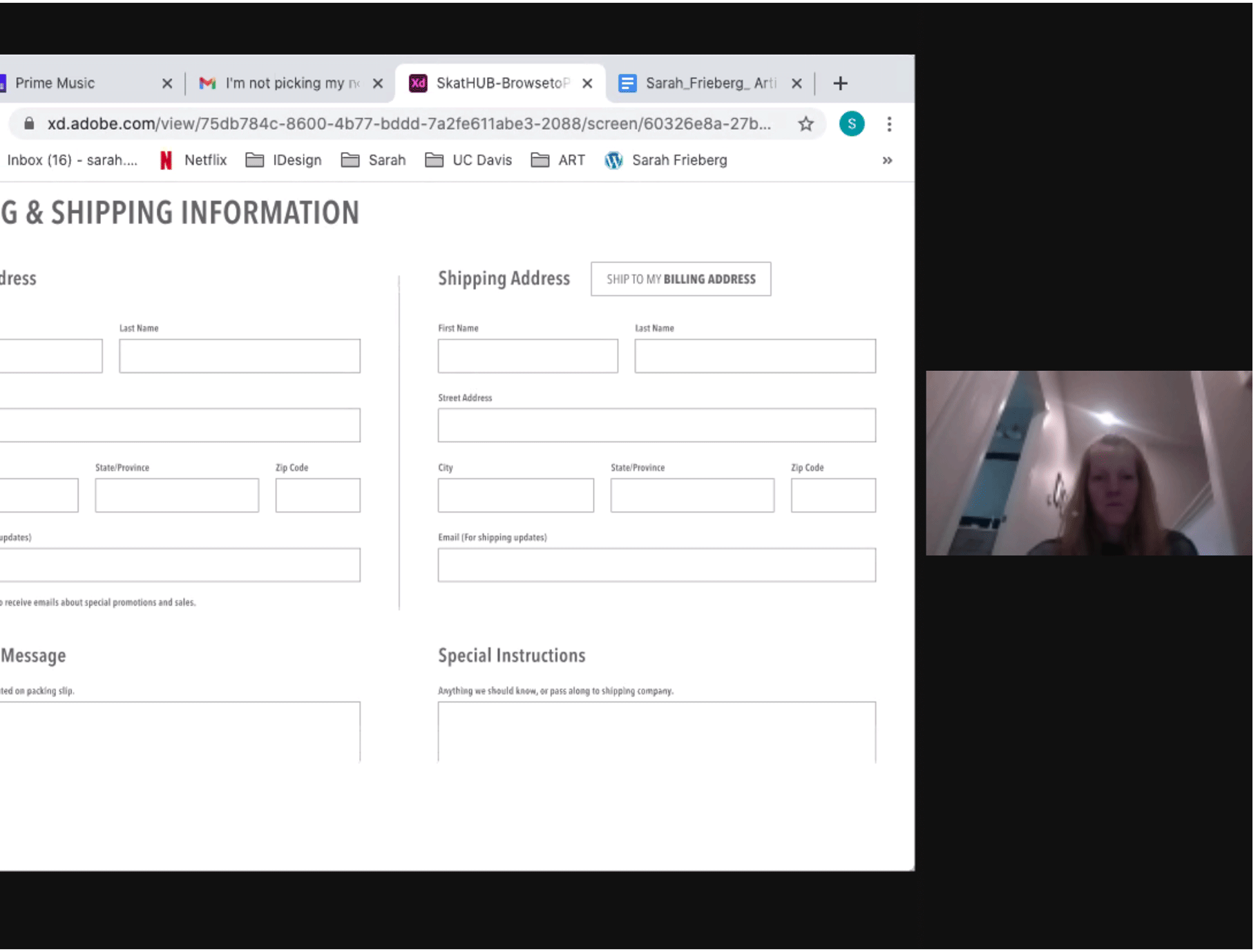
“When I’m starting to give you my information, that’s valuable to me, so I want to know it’s safe.”
High Resolution Prototyping
Drawing from all gathered data, secondary research, competitive analysis, interviews and user testing, a high resolution prototype was produced.
User Interface Design: Industry Examples
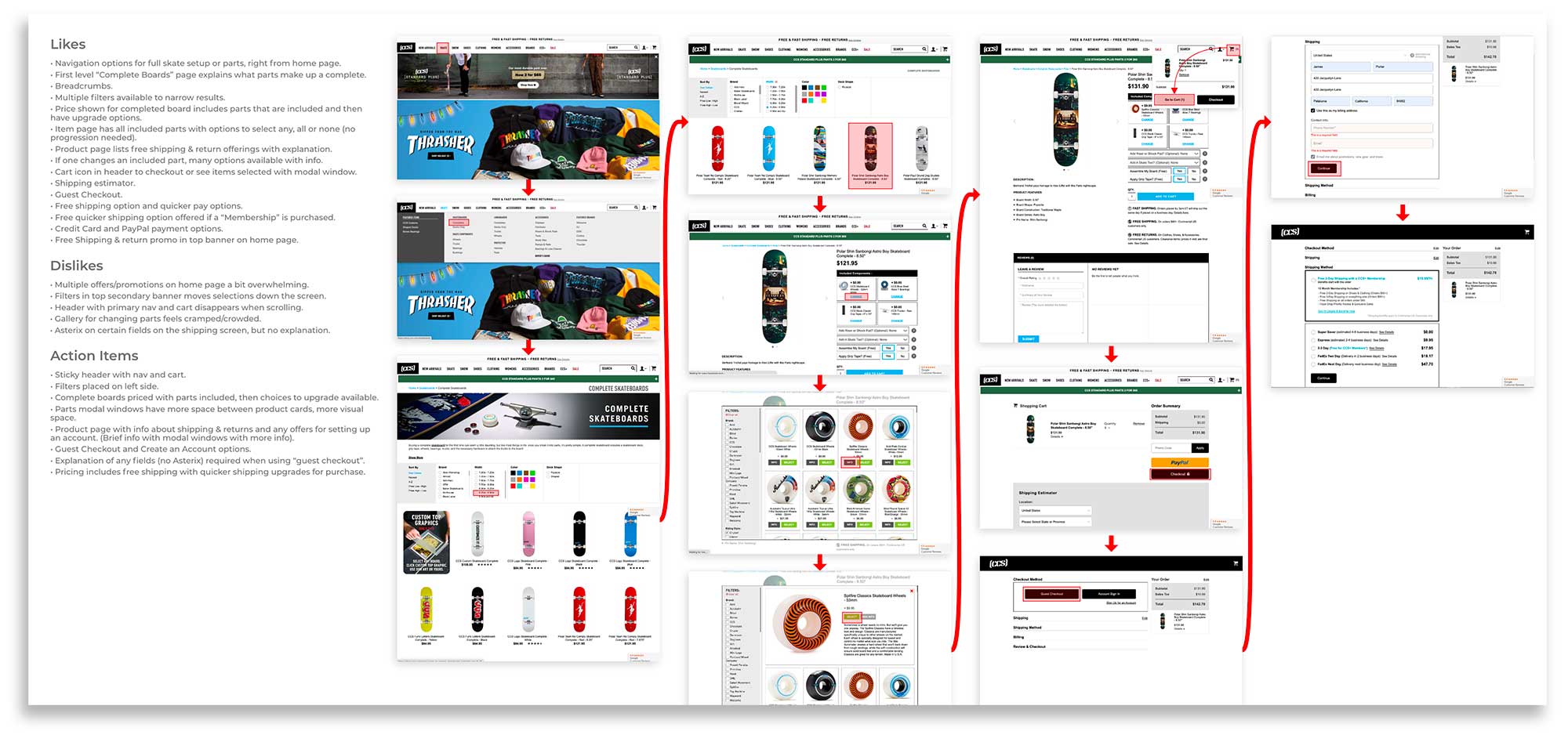
Sites studied for the competitive analysis were drawn heavily upon for many elements of the layout and structure of the user interface. This not only helped compile a list of action items, but allowed for making note specifically of elements referenced both for inclusion and exclusion in the user flow (example below).
User Interface Design: Style Guide
Creating a style guide, setting the tone and look of the platform, allowed for the quick creation of the high fidelity design.

By building out the screens necessary to complete similar tasks as in the wireframe iteration, the full scope of the design and functionality could now be tested.
Some iterations based on wireframe testing were:
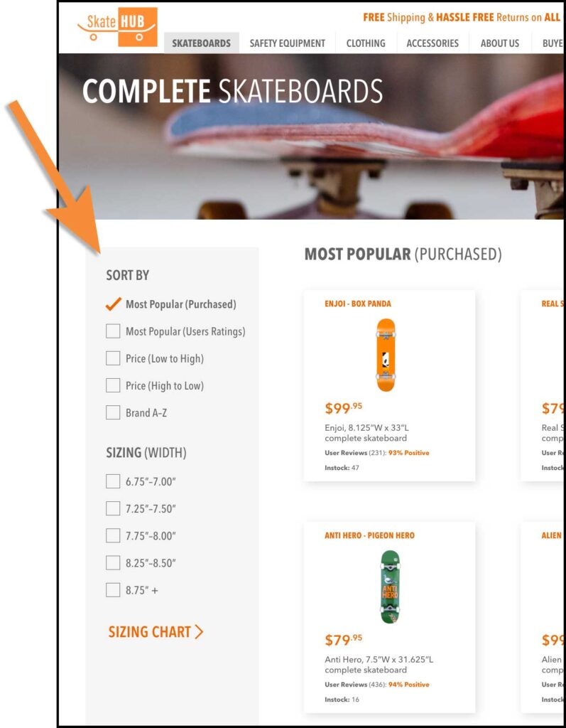
• Adjusting/simplifying filter selections adhering to Heuristic #6 (recognition rather than recall).
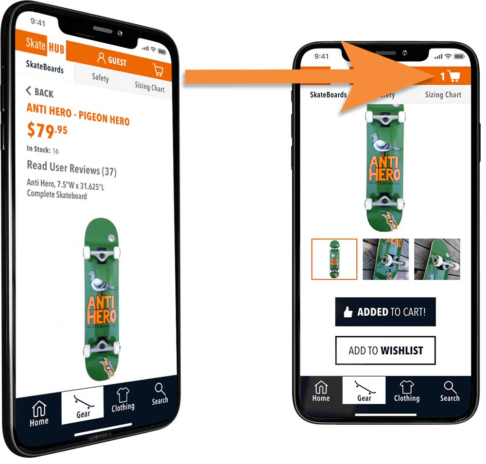
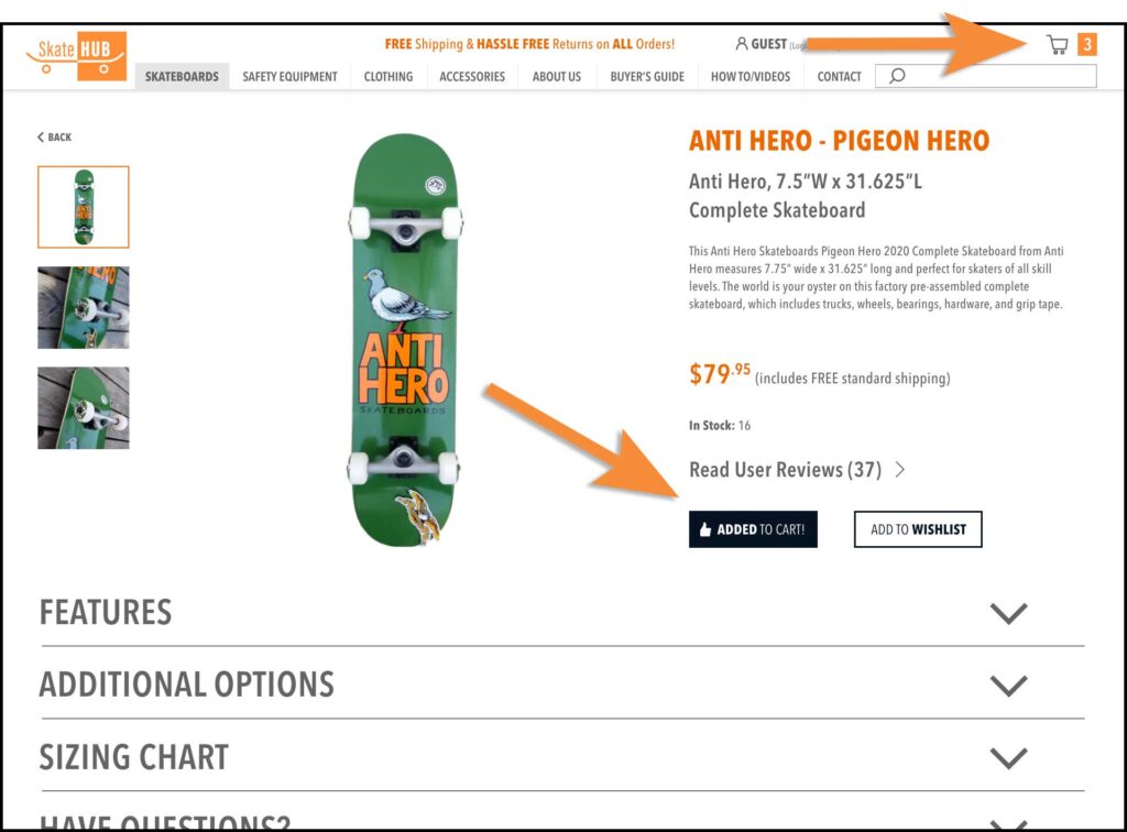
• Including visual confirmation of success, when adding items to cart (Heuristic #1 – visibility of system status).
HiRes Prototyping User Testing
Again utilizing a remote moderated approach, the hires prototype was tested with five new users, to avoid familiarity bias.
Takeaways:
• The Skateboard ‘Sizing Chart’, did not adhere to the Consistency and Standards Hueristic Principle. Different verbiage and sizing references were used in varying locations, causing confusion.
• Consumers wanted to see their itemized cart throughout the checkout process, providing peace of mind.
Some other minor concerns related to quickly locating specific information on certain screens.
High Resolution Iteration
The final step of this project, due to time constraints, was to update the design based on the latest round of user feedback.
Addressing the two major issues identified in testing, the prototype was iterated to:
• Have identical information in all locations of the ‘Sizing Chart’.
• Reformat the itemized shopping cart so it could be included in all checkout screens without creating visual congestion.

Conclusion
At the end of the project, the initial sales funnel issues had been address and solutions tested.
However, the only true test would be sales metrics over time…to qualify if what users SAY aligns with their actions, when ACTUALLY forking over the ‘dough’.

Outcome & Results
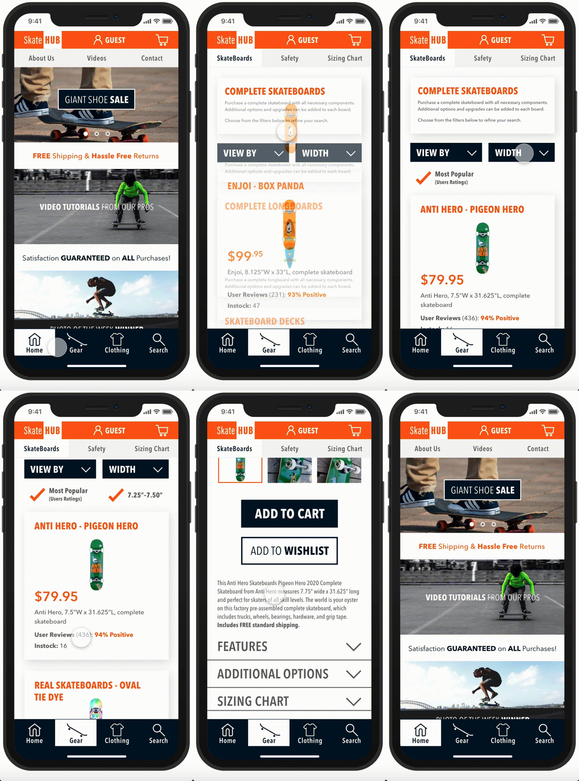
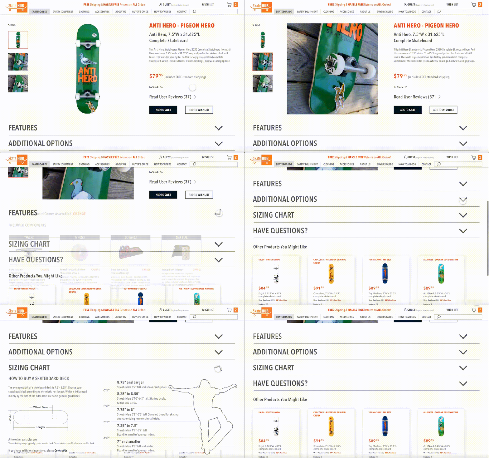
Due to time constraints, this project concluded with the second iteration of a high resolution prototype (for both mobile and web applications). After the most recent round of user testing, all participants were easily able to find the desired product, assisted by embedded resources, and complete their purchase.
Find a Product (mobile)
Resources to Support the Purchase (web)
Lessons Learned
• If a user can’t find resources to dispel questions/confusion easily, you will lose them.
• Users bring past negative e-commerce experiences with them when they enter an unfamiliar site.
• E-commerce customers have an inherent distrust, when personal information is requested without a good reason.
• For most, feedback from peers carries much more weight than statistics or facts, in dispelling concerns of product quality.
• A site that provides a sense of community and/or shares stories/images/videos of its principles, appears more trustworthy too many consumers.
